• Home
  • Our Story
    • About Us
    • Awards
    • Pressroom
  • Projects
  • Contacts
EN PT
  • Home
  • Our Story
    • About Us
    • Awards
    • Pressroom
  • Projects
  • Contacts

Let’s work together

Like our work? Arrange a meeting with us at our office, We'll be happy to work with you!

Wanna join our crazy team?

We are always looking for new talents and we were expecting you. Time to apply, buddy!

  • Home
  • Our Story
    • About Us
    • Awards
    • Pressroom
  • Projects
  • Contacts

Search

estudio AMATAM
EN PT
Search site...
  • Home
  • Our Story
    • About Us
    • Awards
    • Pressroom
  • Projects
  • Contacts
  • Instagram
  • Facebook
  • Pinterest
  • Twitter
  • Email
Estúdio AMATAM © Copyright 2017. All Rights Reserved.
estudio AMATAM
EN PT
Search site...
  • Home
  • Our Story
    • About Us
    • Awards
    • Pressroom
  • Projects
  • Contacts
  • Instagram
  • Facebook
  • Pinterest
  • Twitter
  • Email
Estúdio AMATAM © Copyright 2017. All Rights Reserved.
  • Home
  • Our Story
    • About Us
    • Awards
    • Pressroom
  • Projects
  • Contacts
  • Instagram
  • Facebook
  • Pinterest
  • Twitter
  • Email
Estúdio AMATAM © Copyright 2017. All Rights Reserved.

Kalorias Montijo

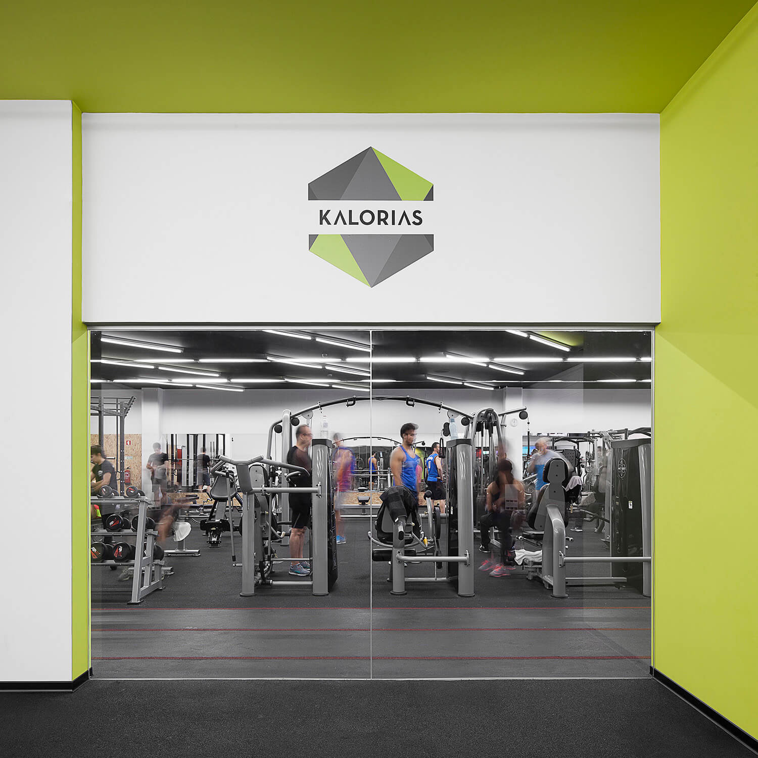
The KALORIAS group decided to renovate its image and proposed us to transform a vacant retail store into the new Kalorias Club unit, embed in the new brand concept. It should not be just another gym, however the development of a new image and unique identity able to be replicable in future clubs. Despite the creative challenge the budget was not proportional to the task, which made increasingly high the level of difficulty of the task upon us. The search for suitable materials at affordable costs, the choice for simple constructive solutions; the prioritization of nuclear areas in order to enhance the identity of the space; and the efficient use of resources were always present concerns. Above all, our design thinking was focus in the assumption that this should be a gym for everyone, young and old, athletes and sedentary, a welcoming and socializing environment, a real club for the family: modern and functional.

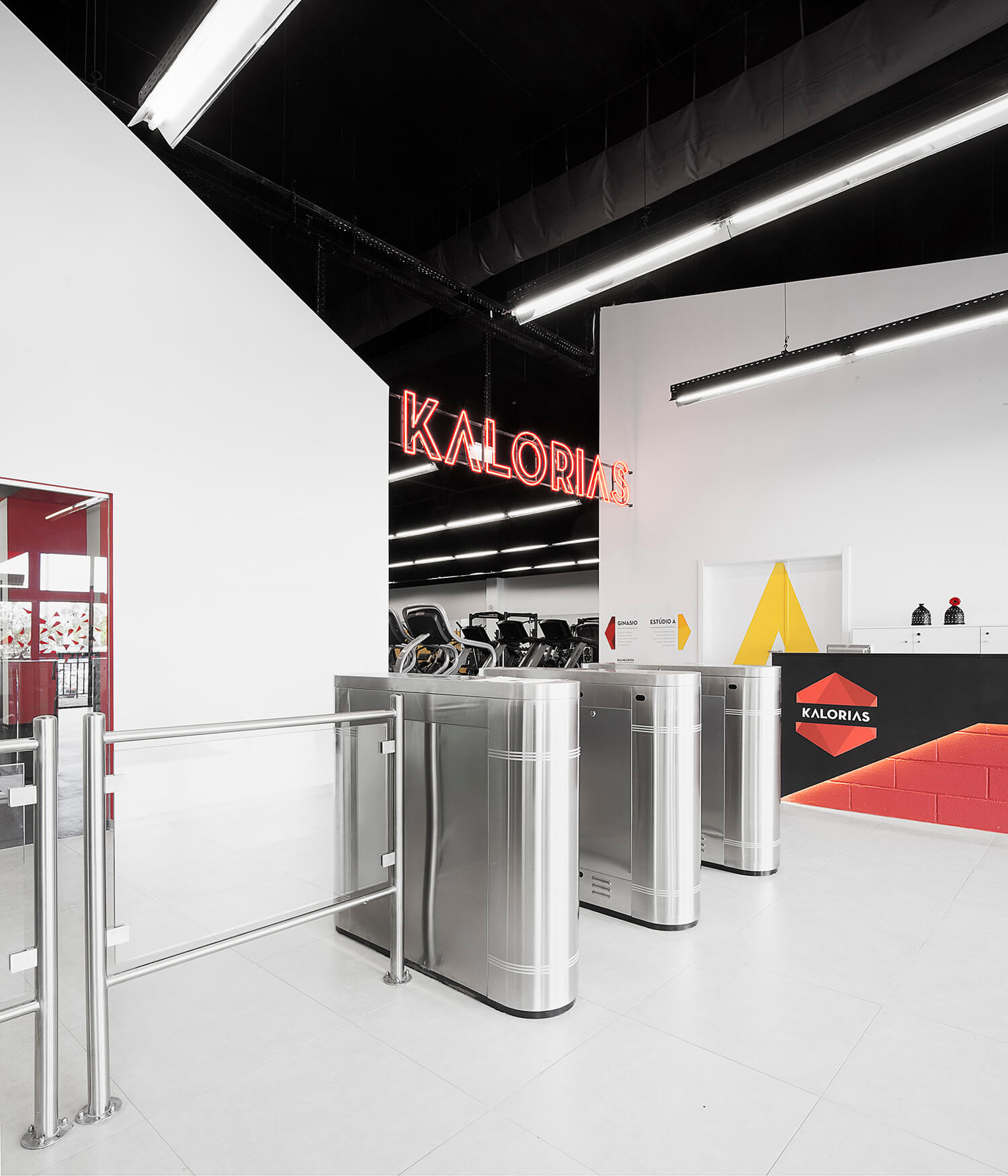
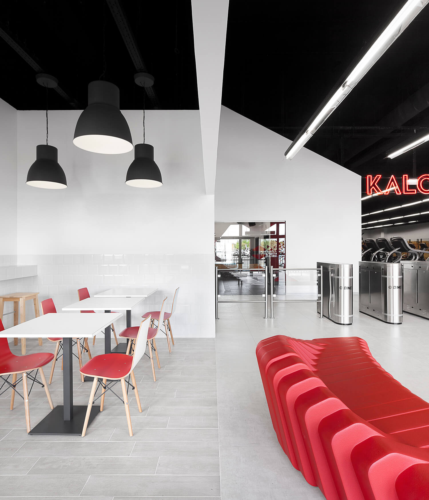
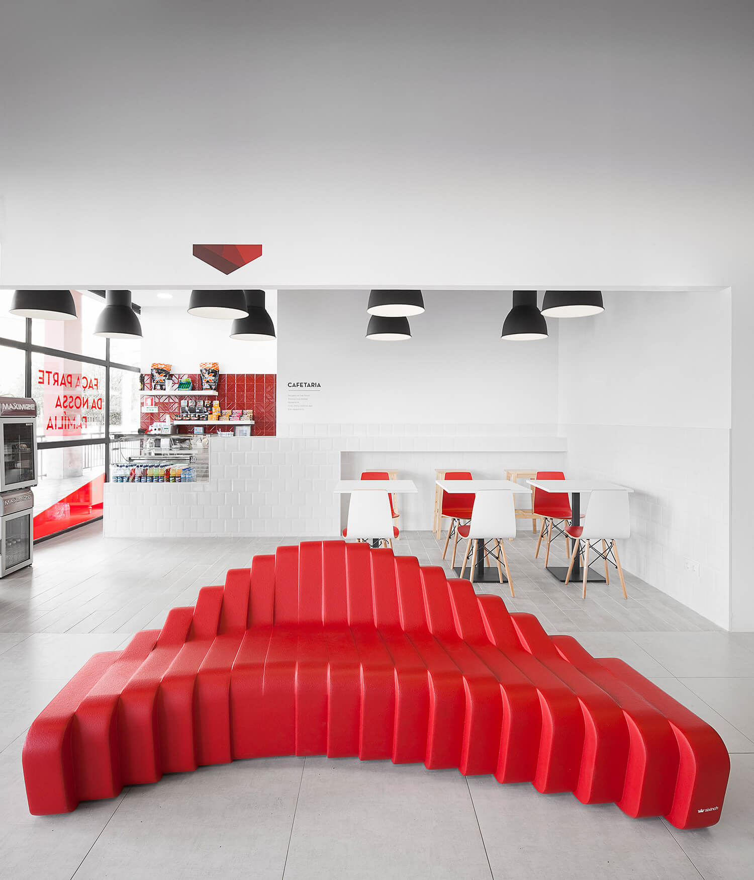
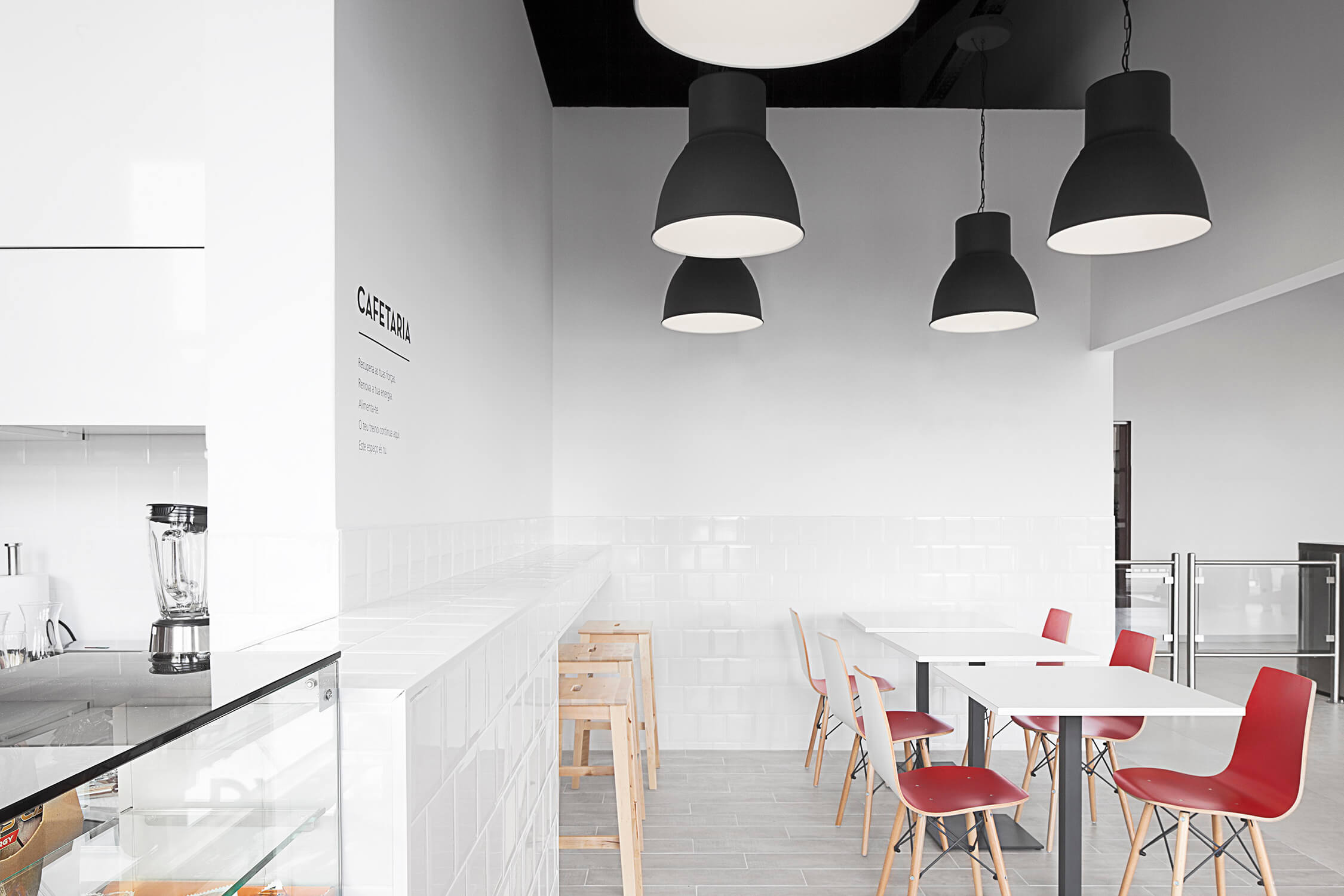
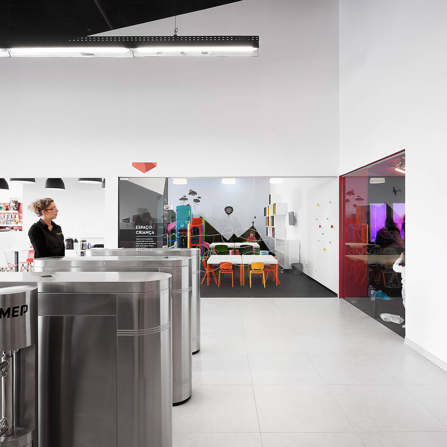
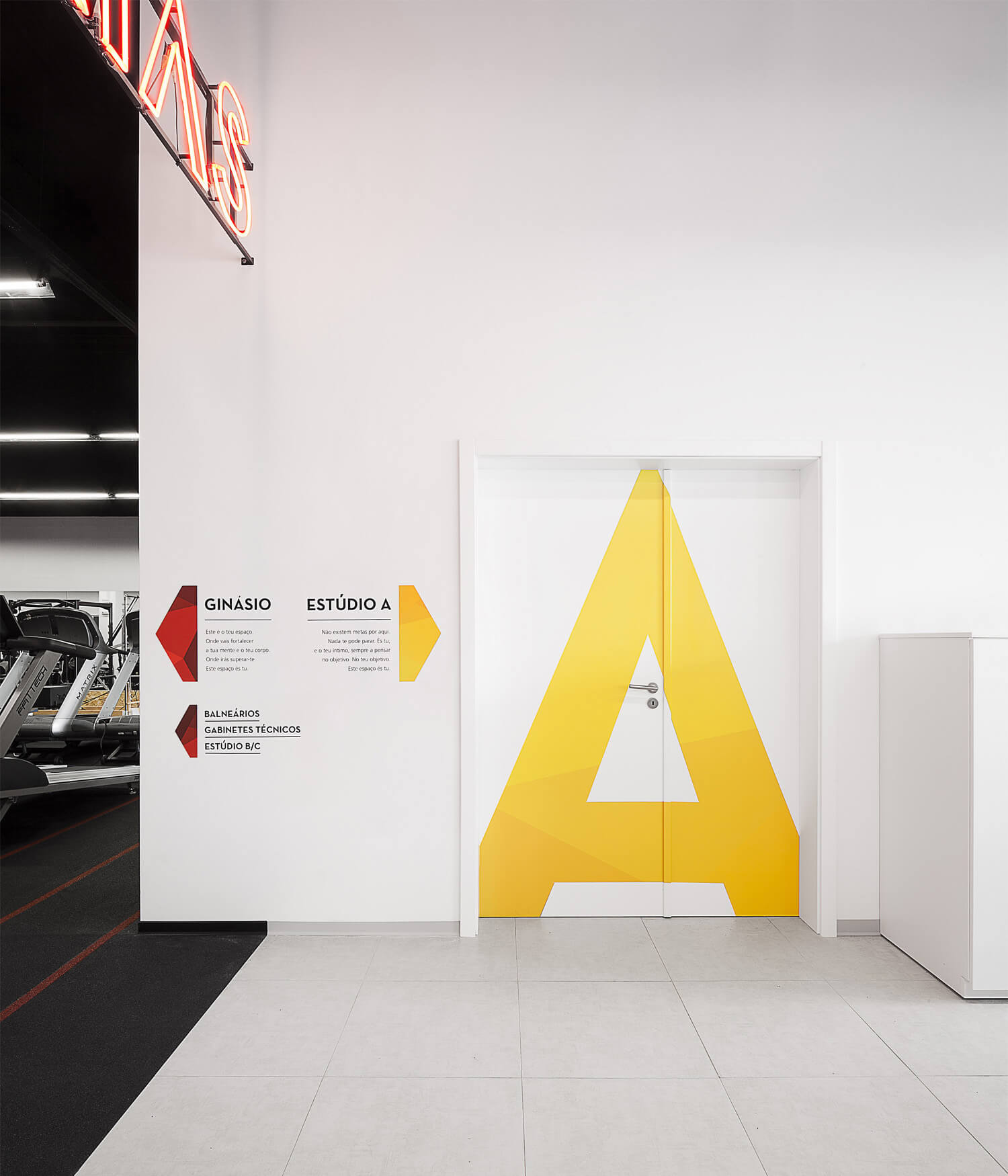
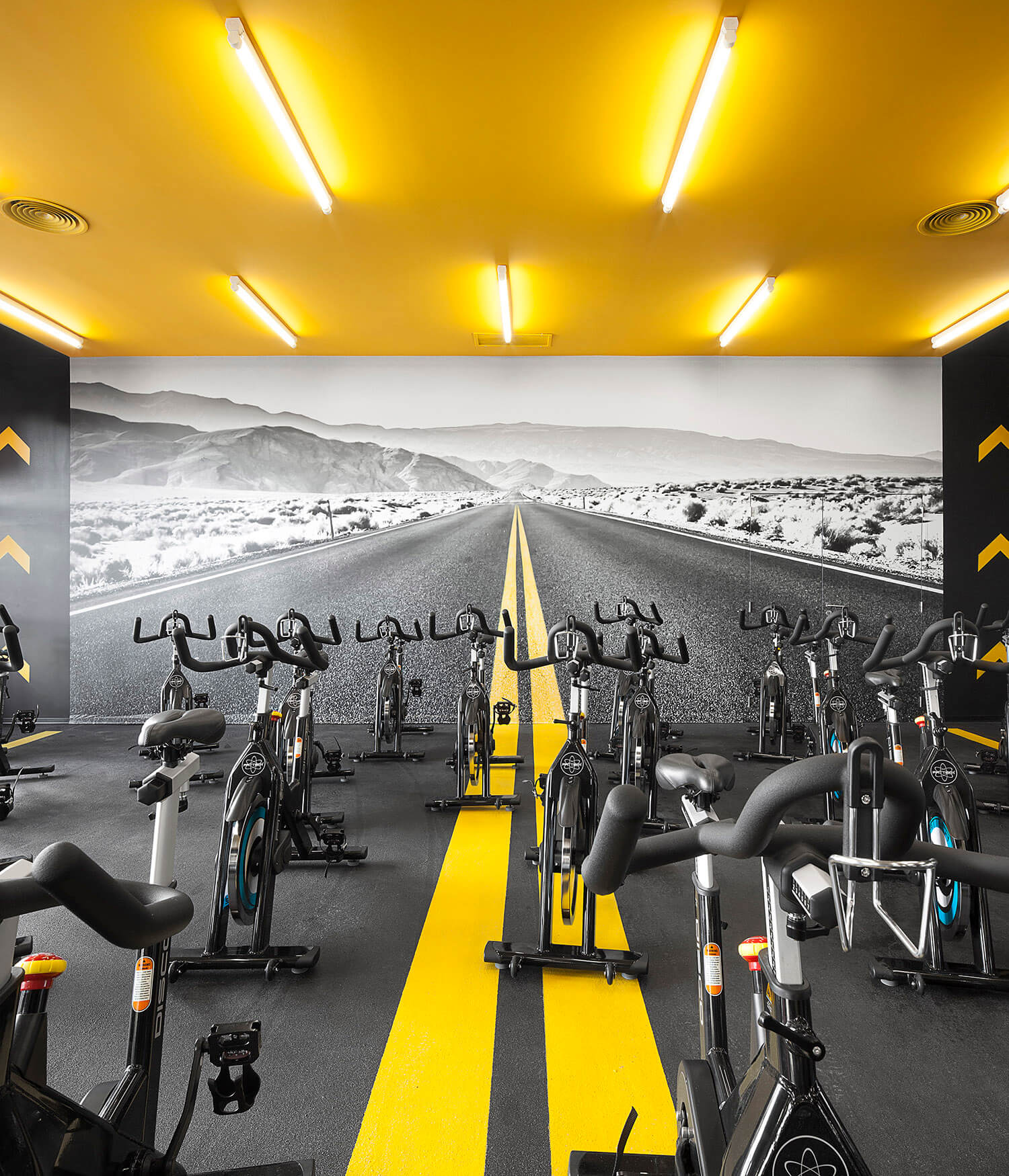
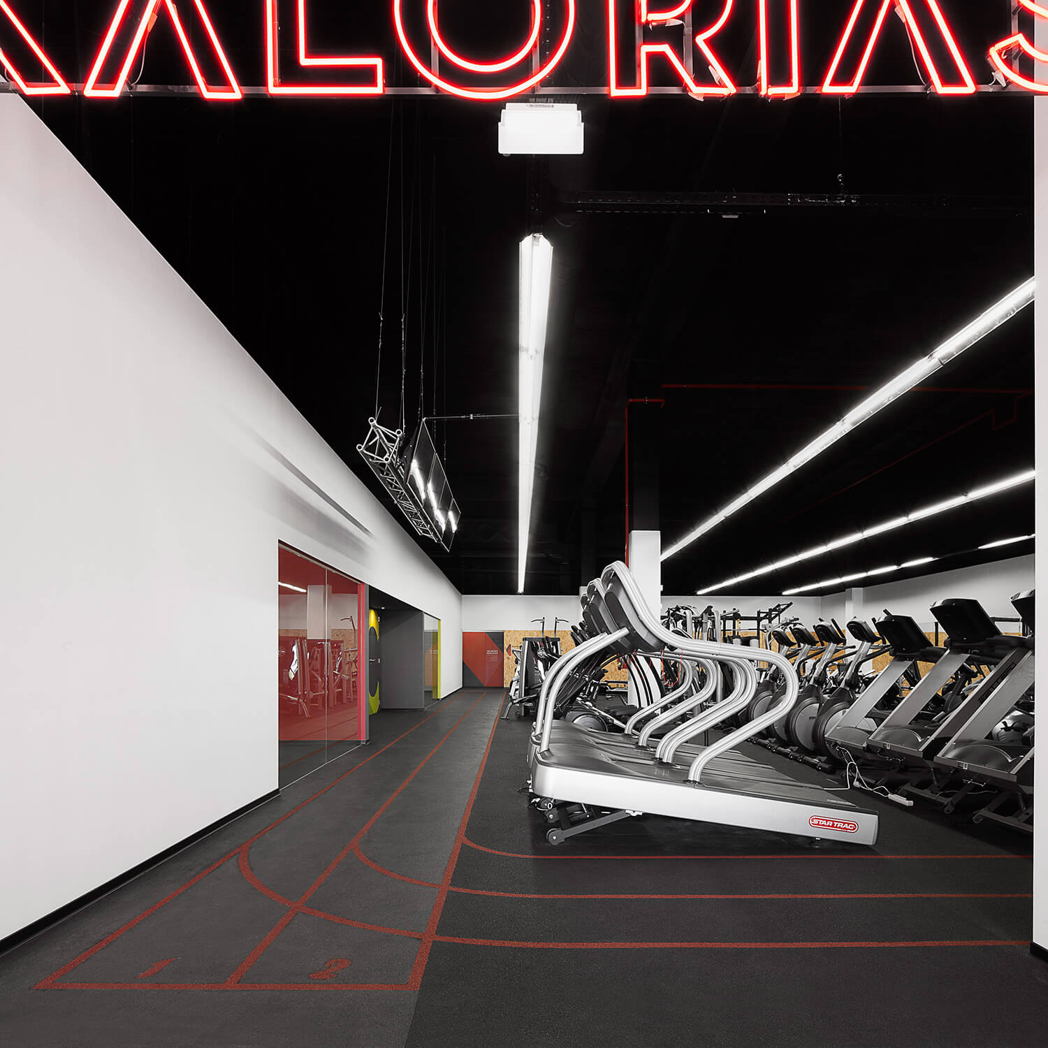
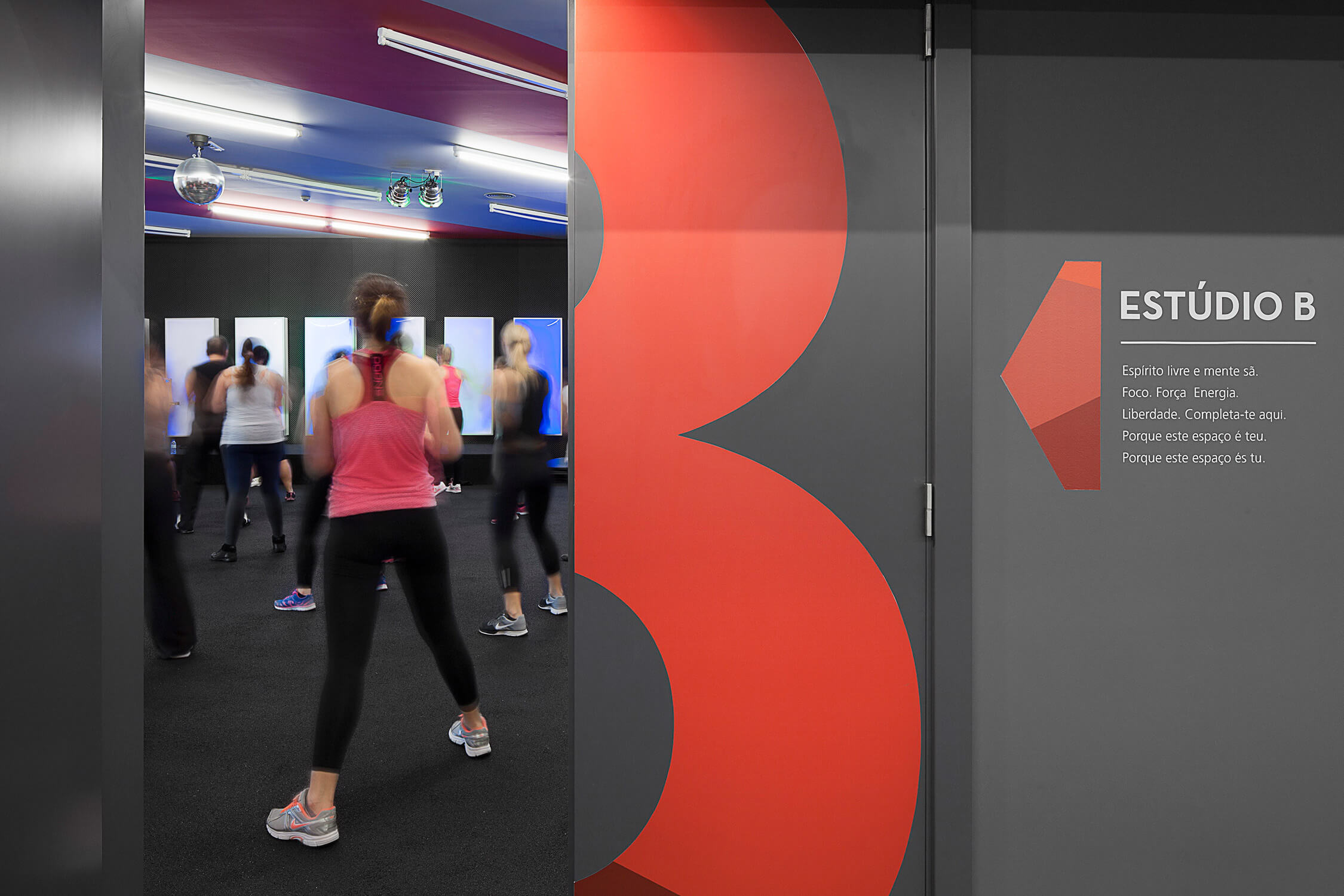
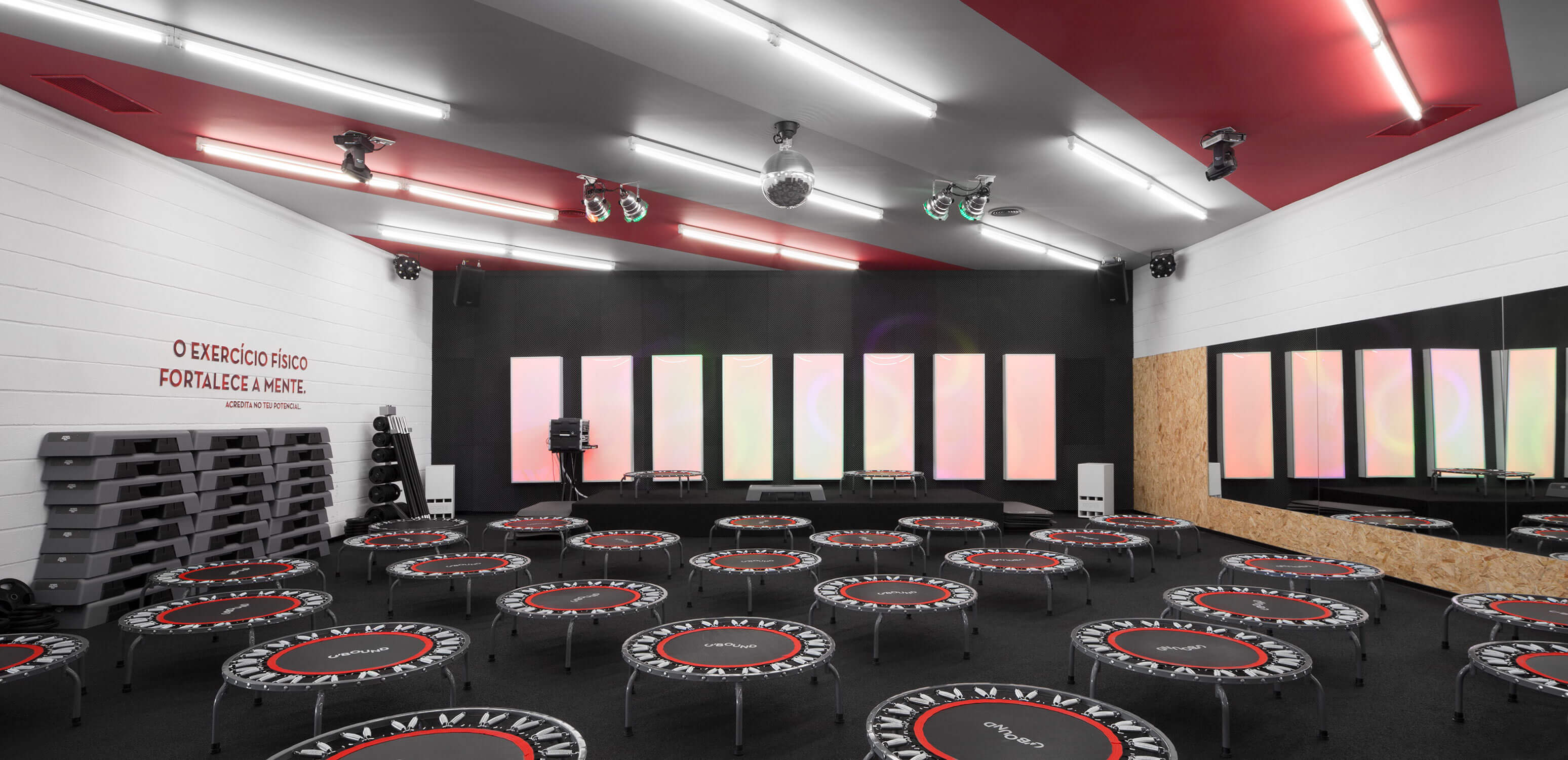
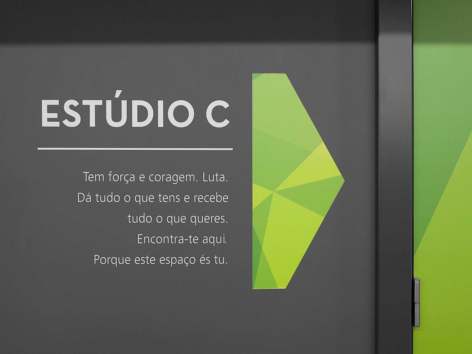
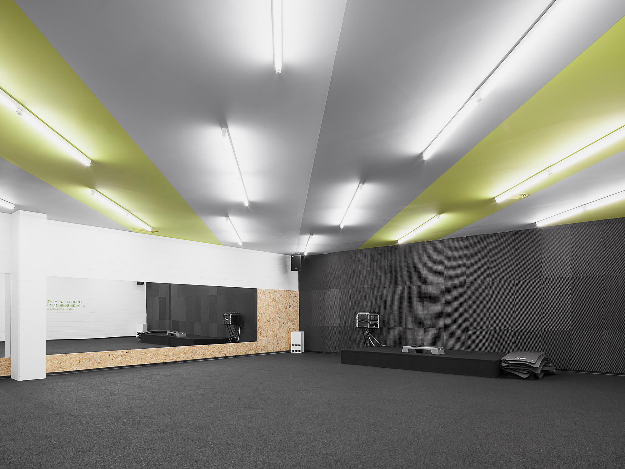
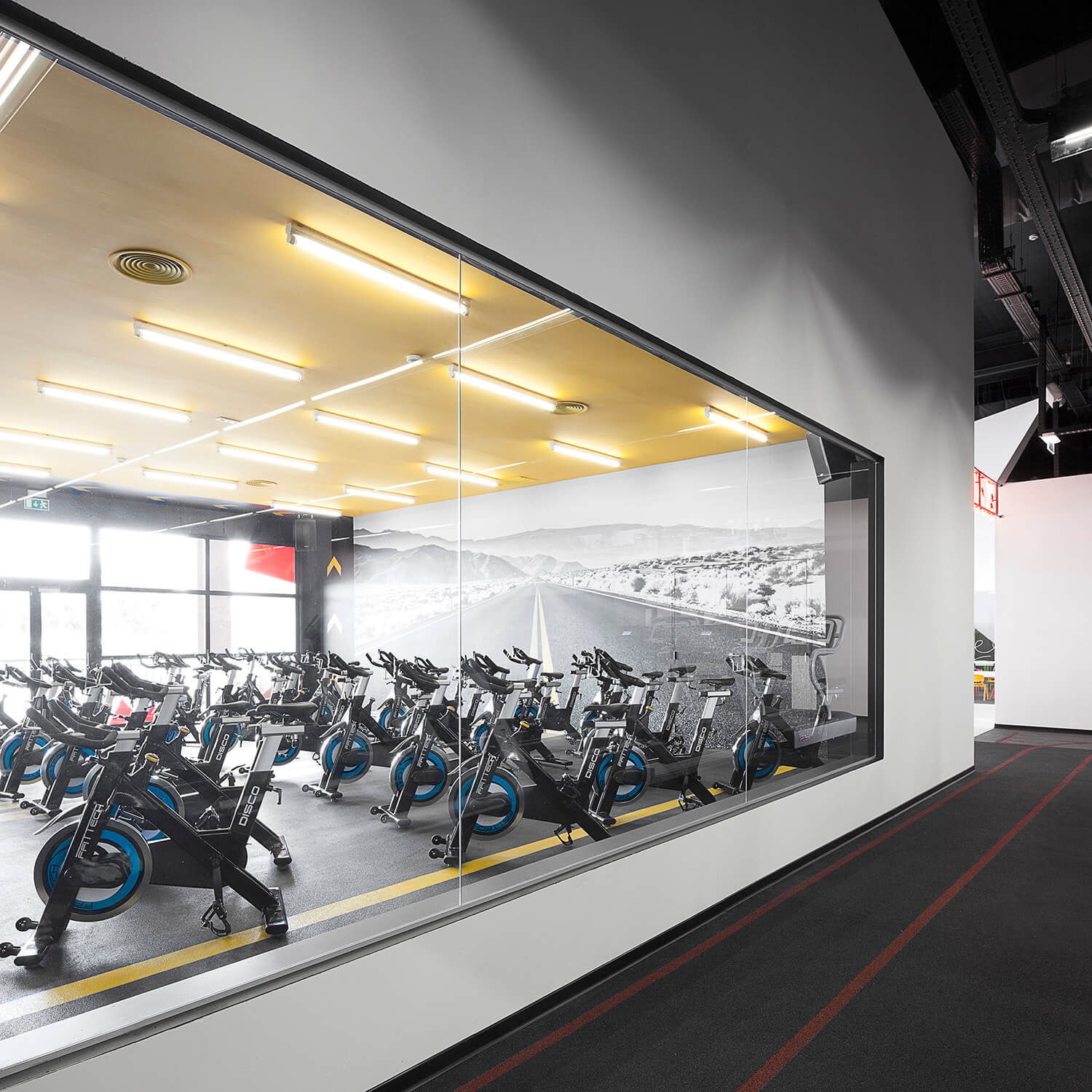
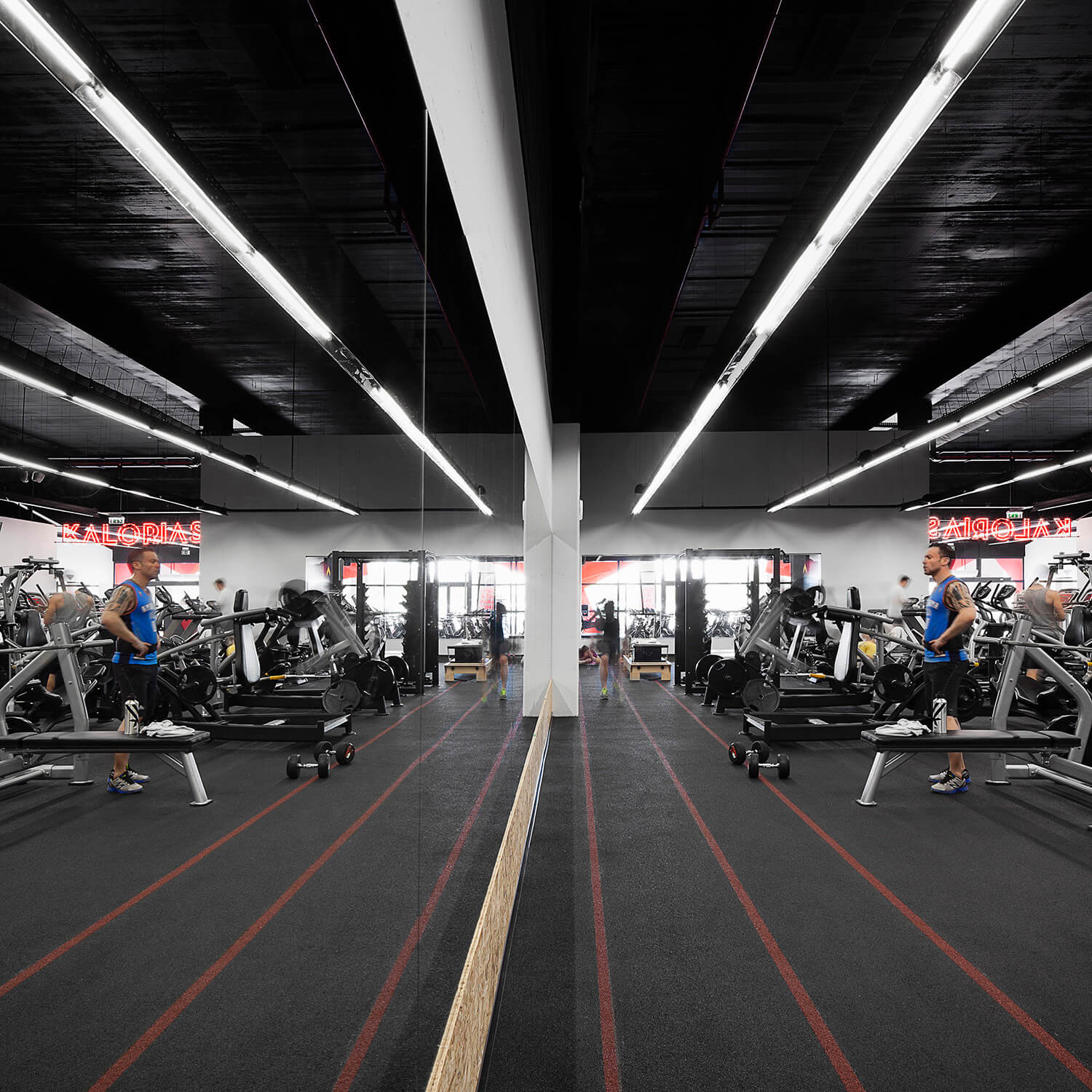
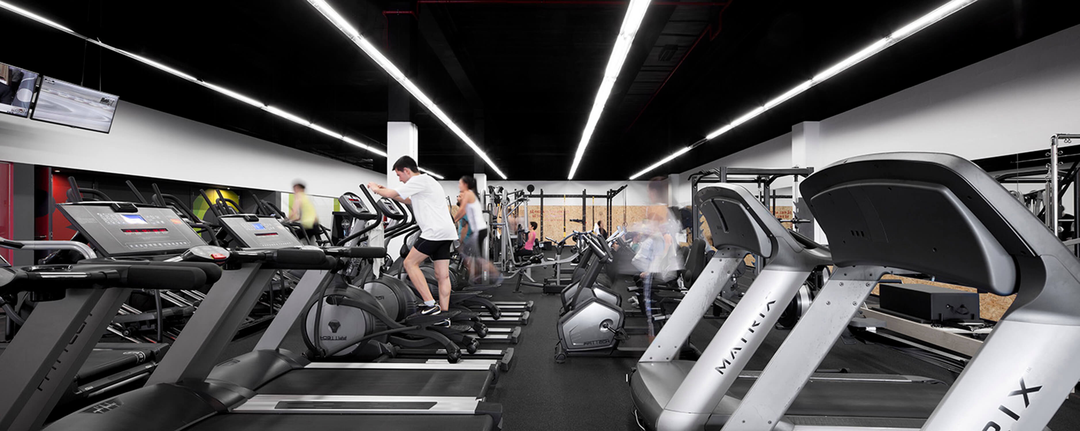
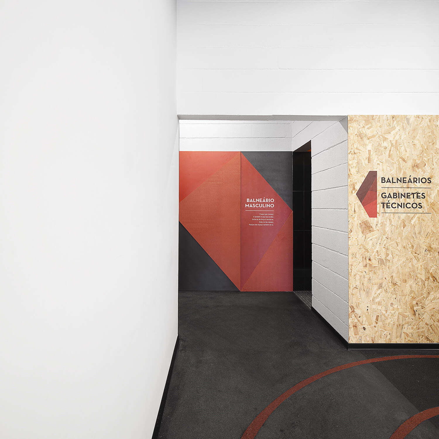
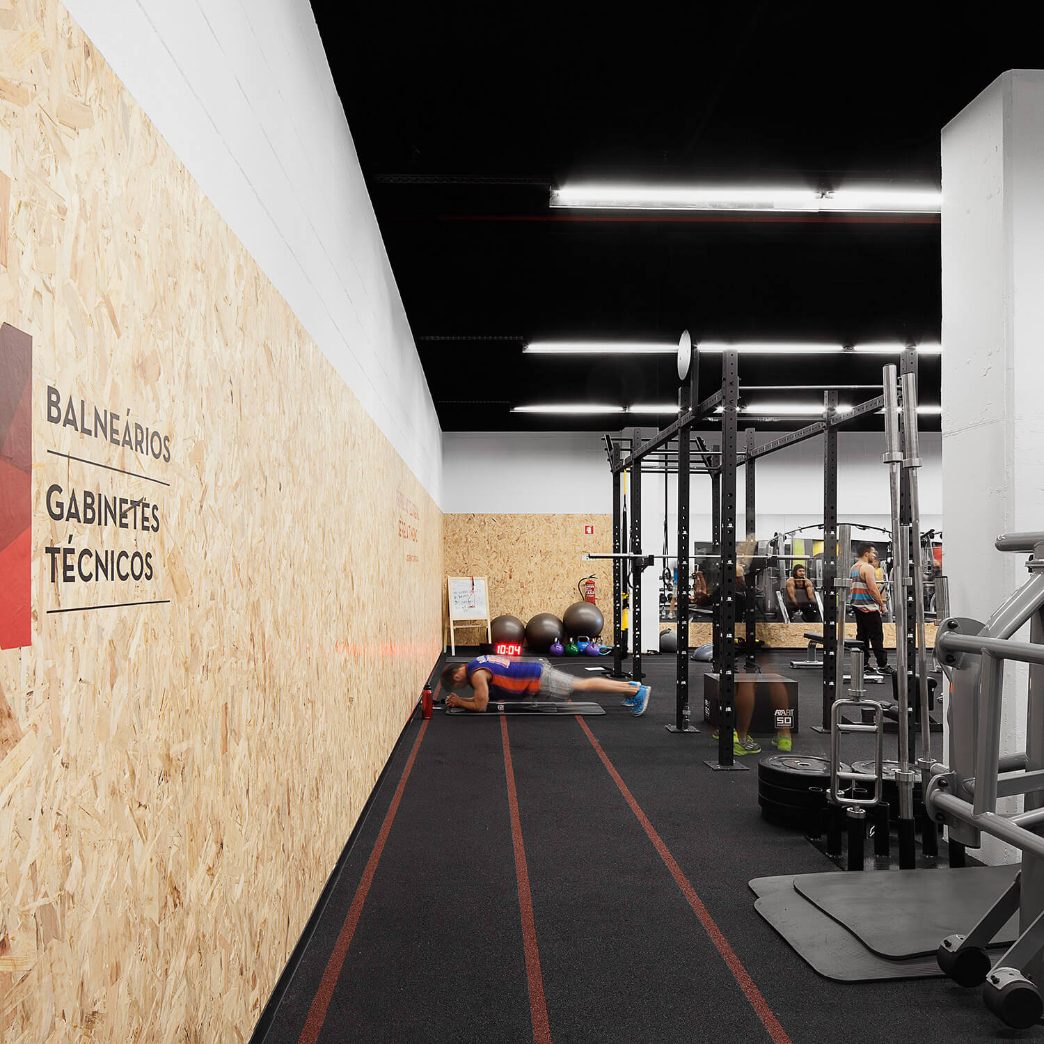
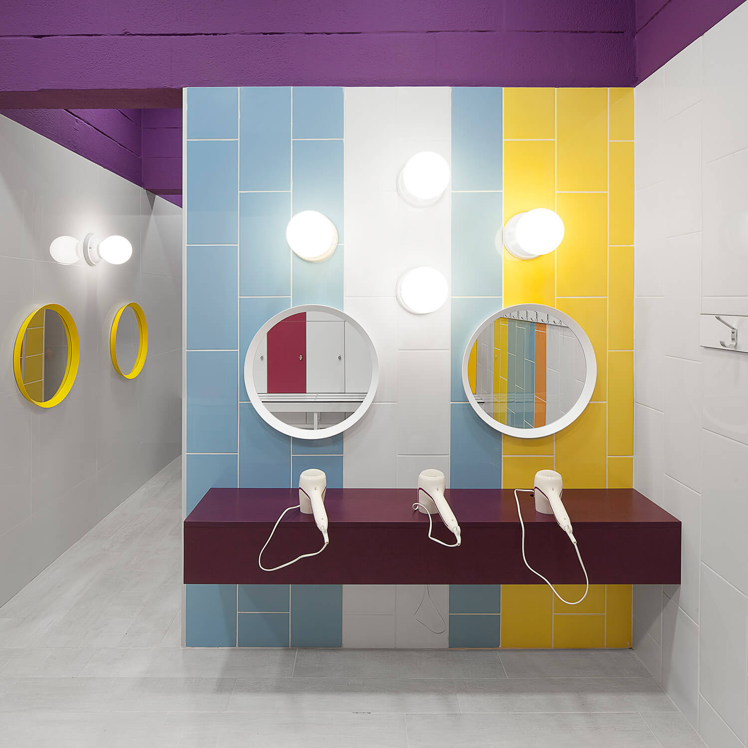
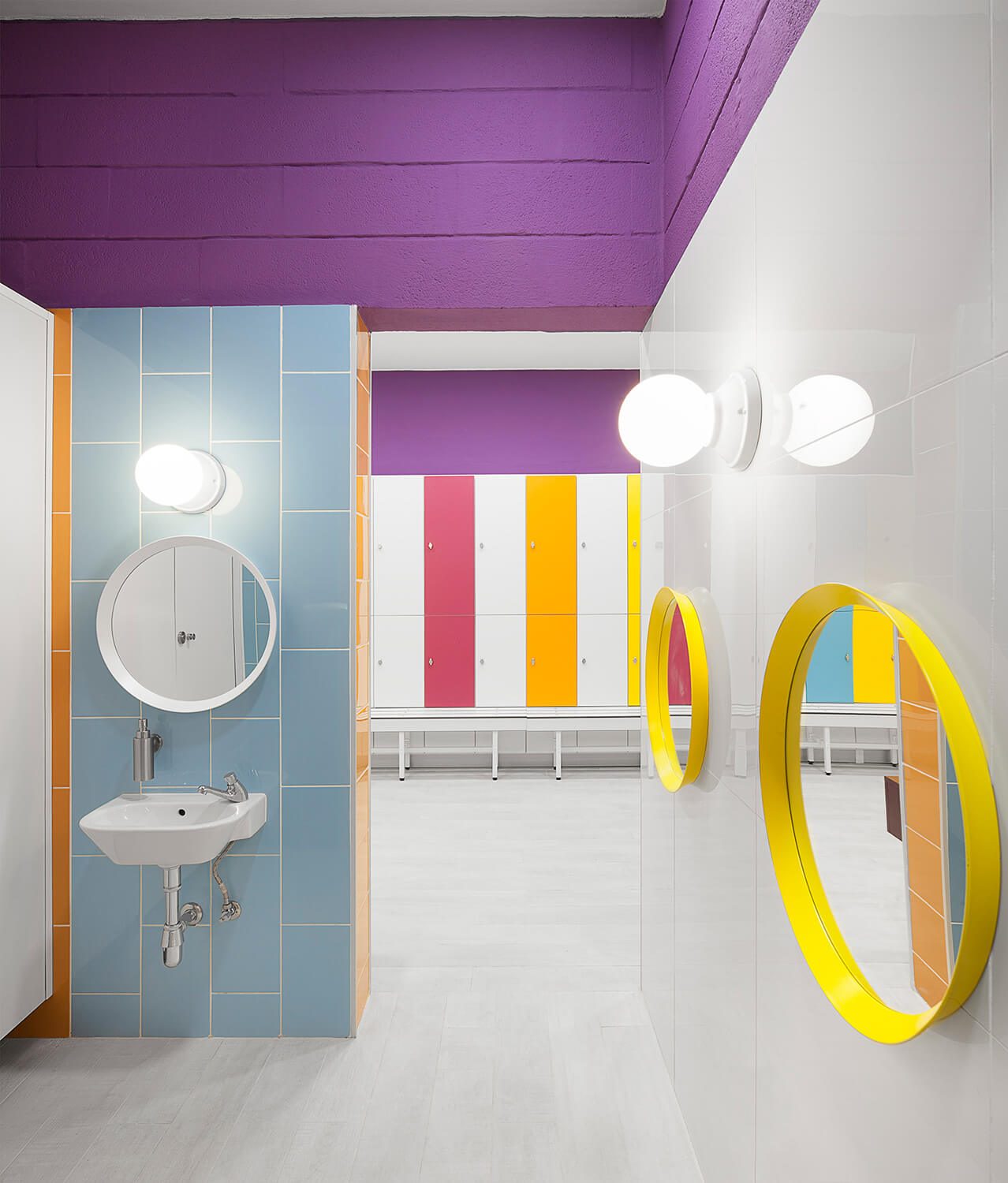
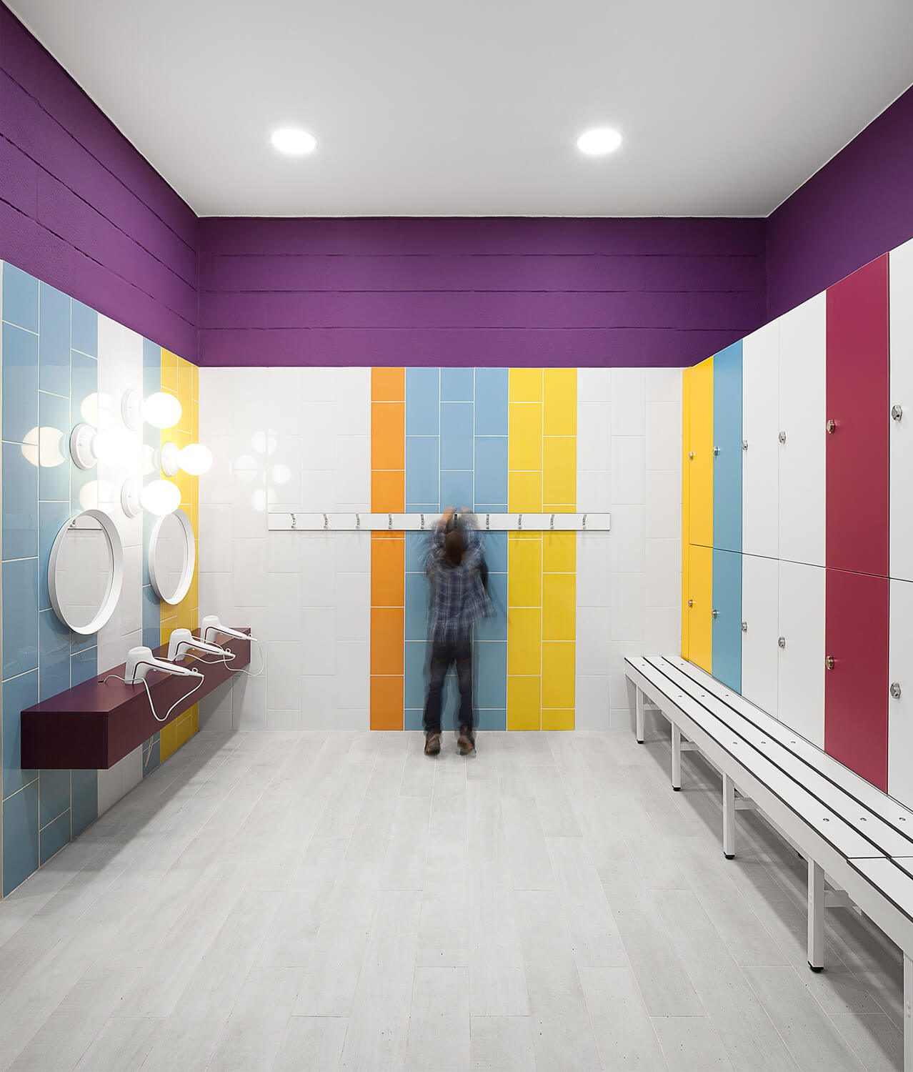
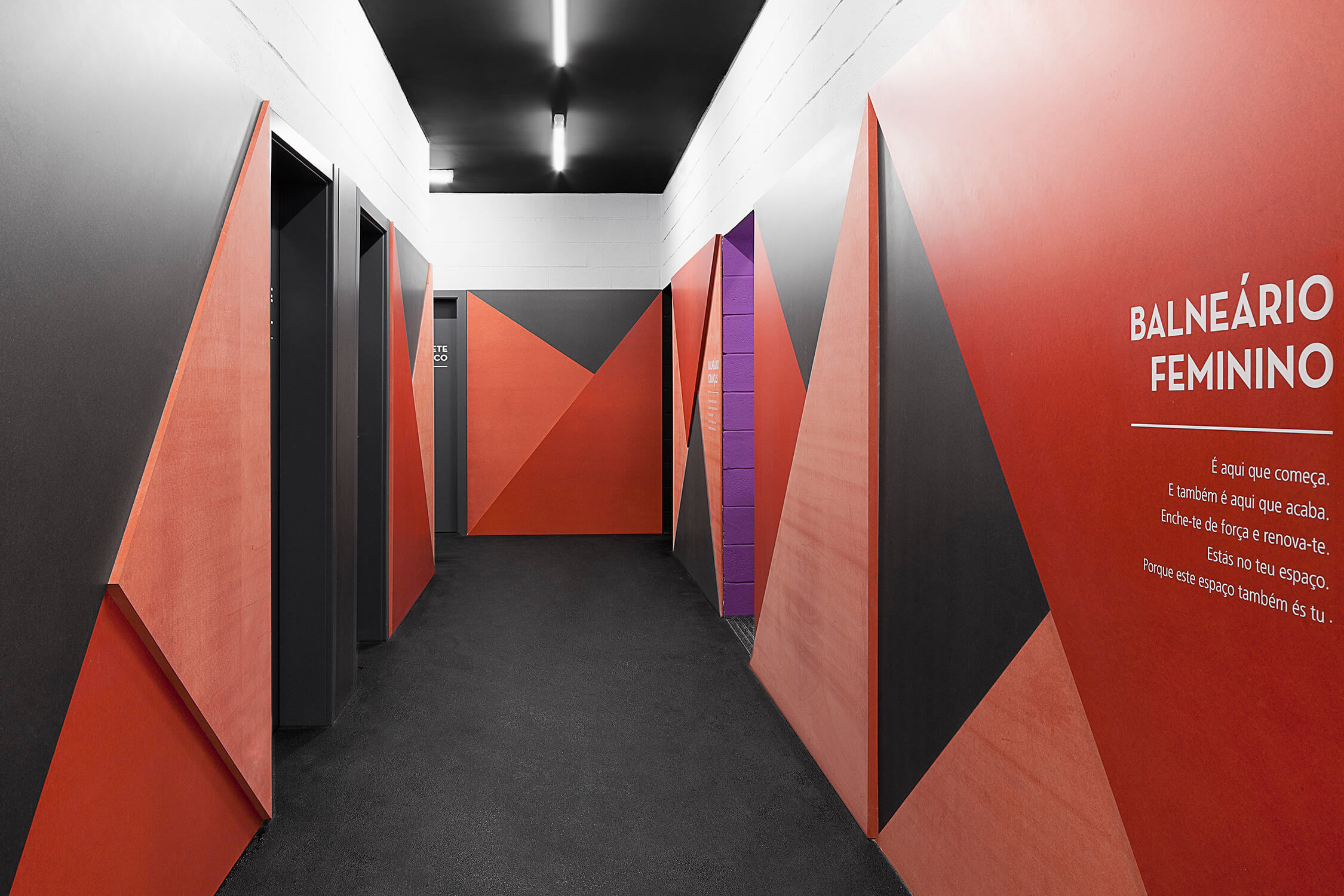
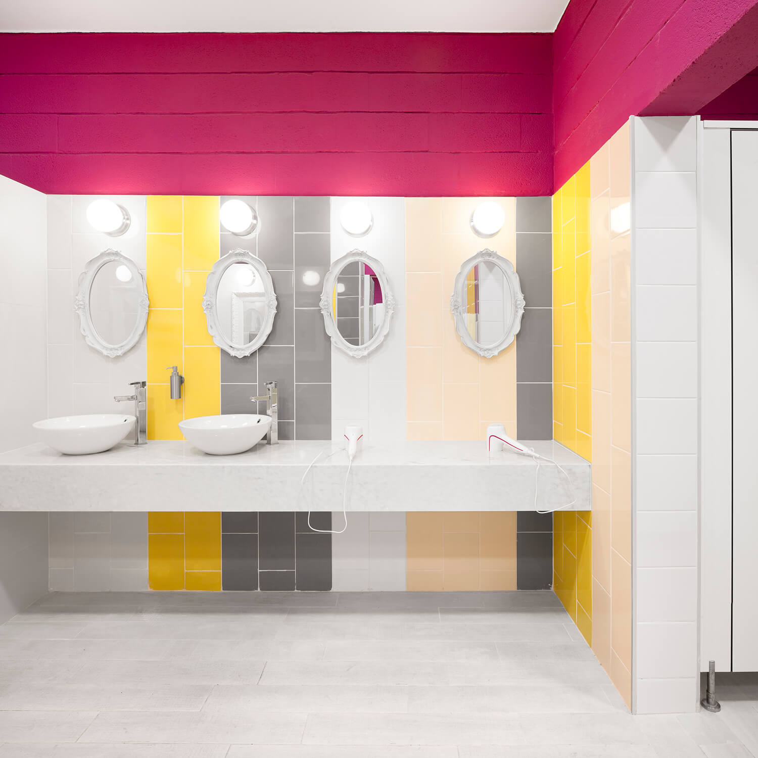
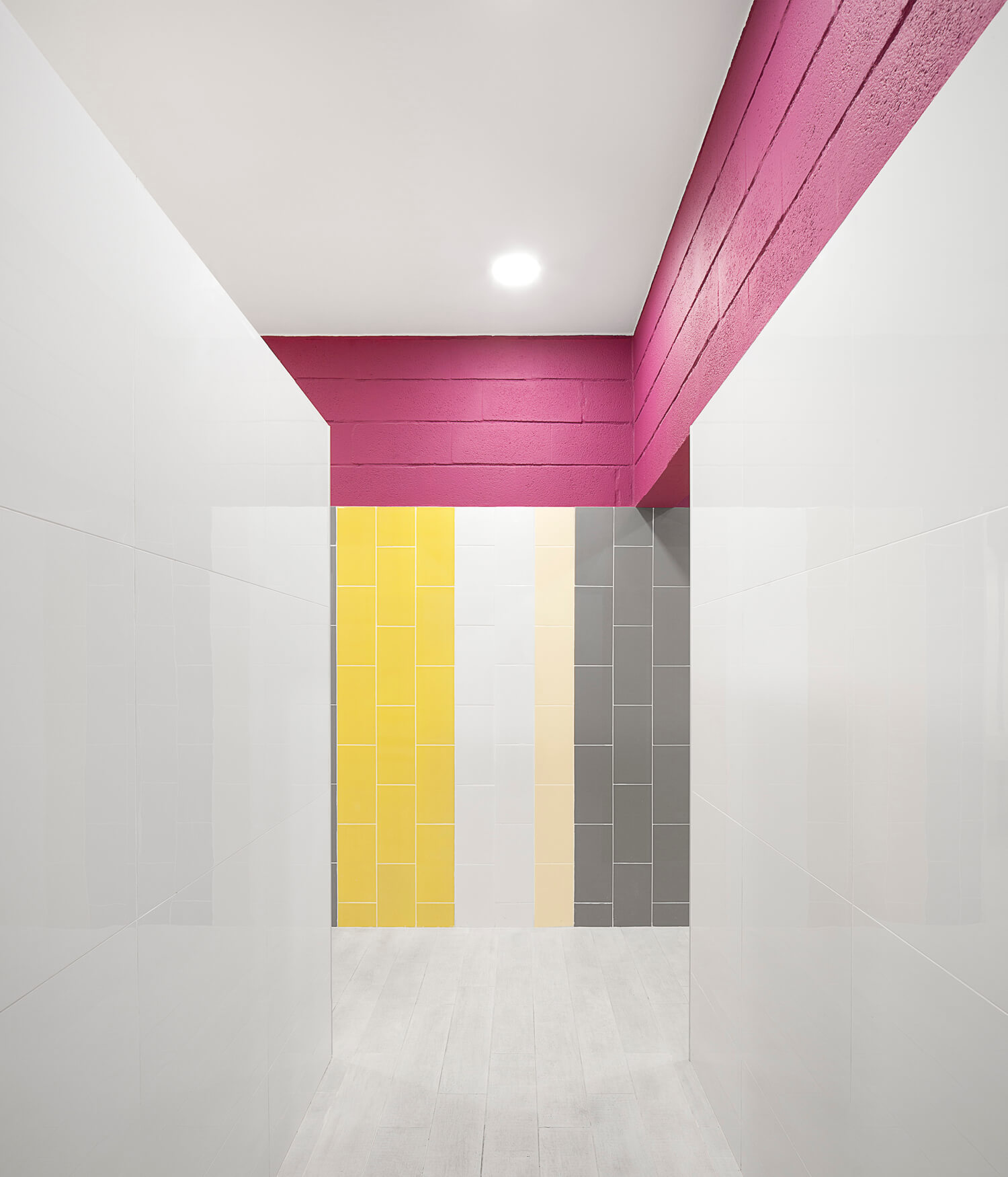
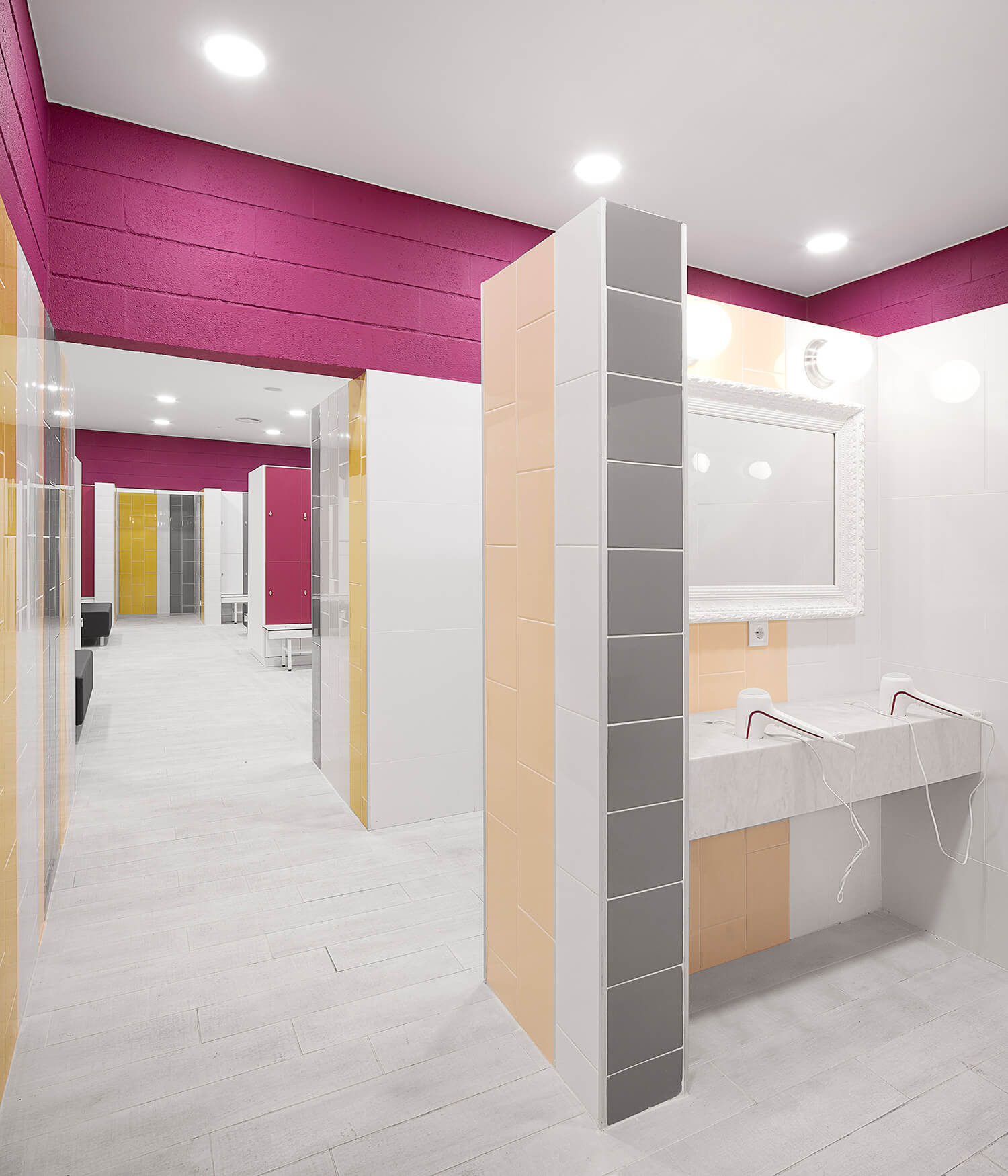
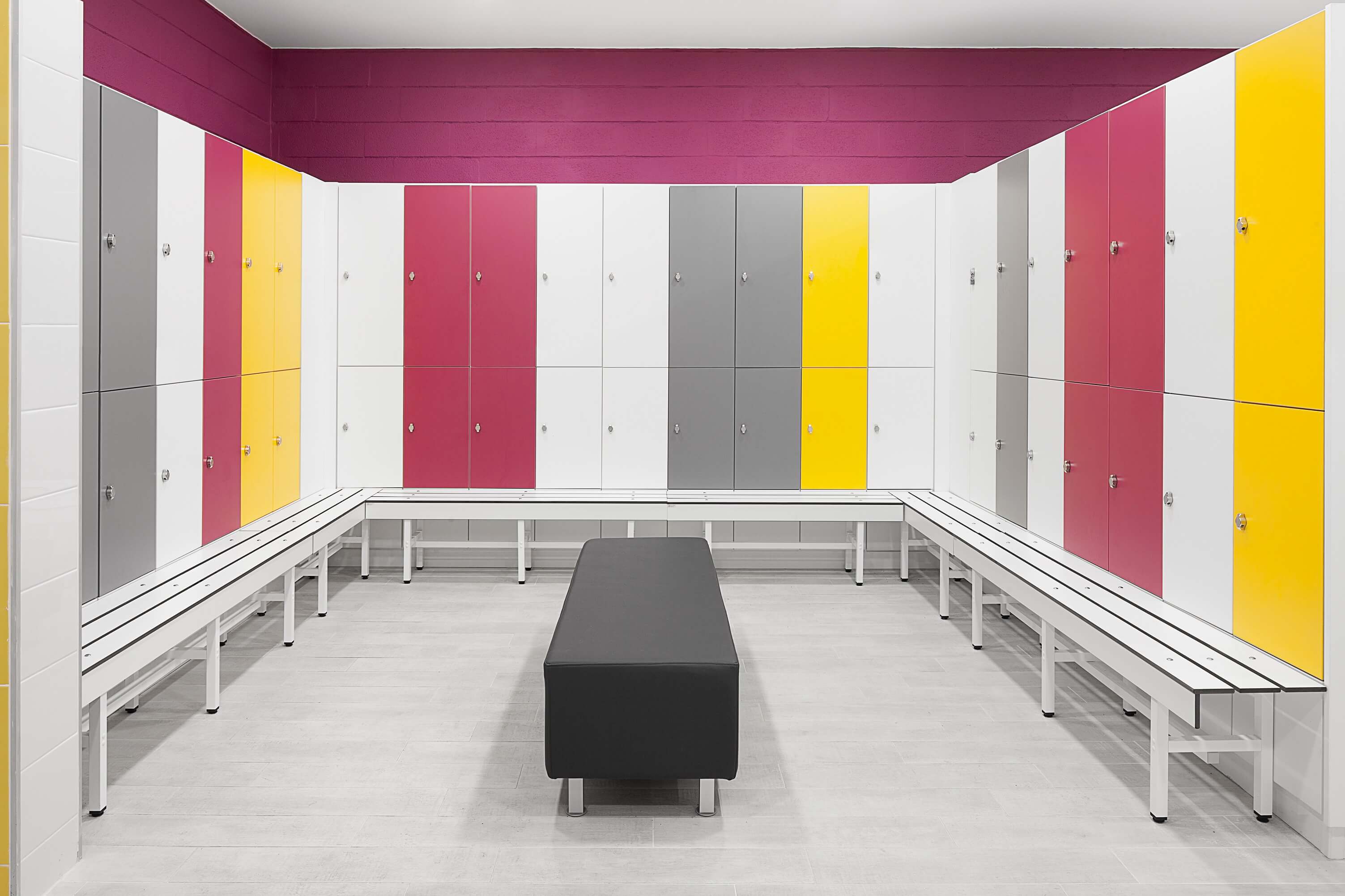
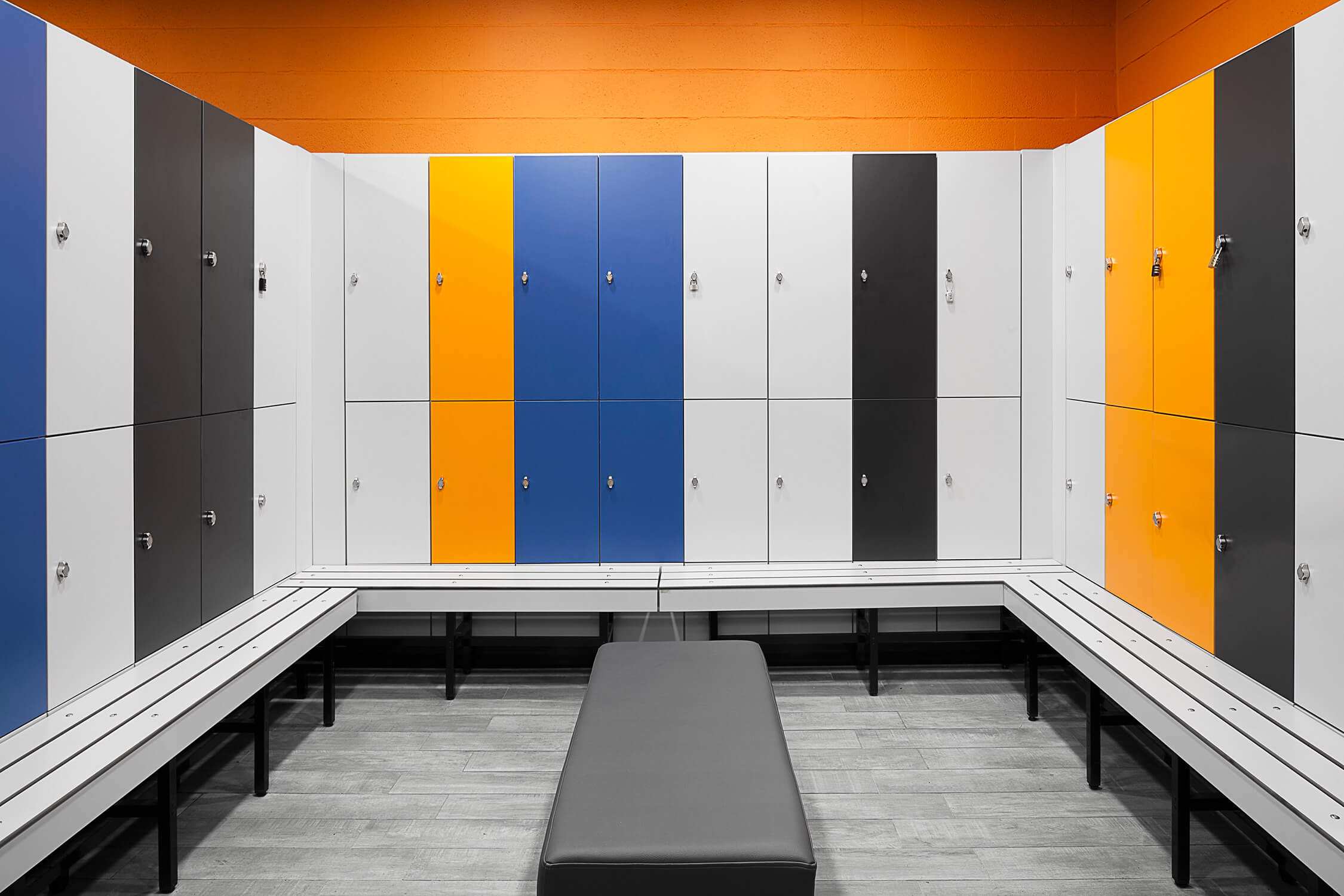
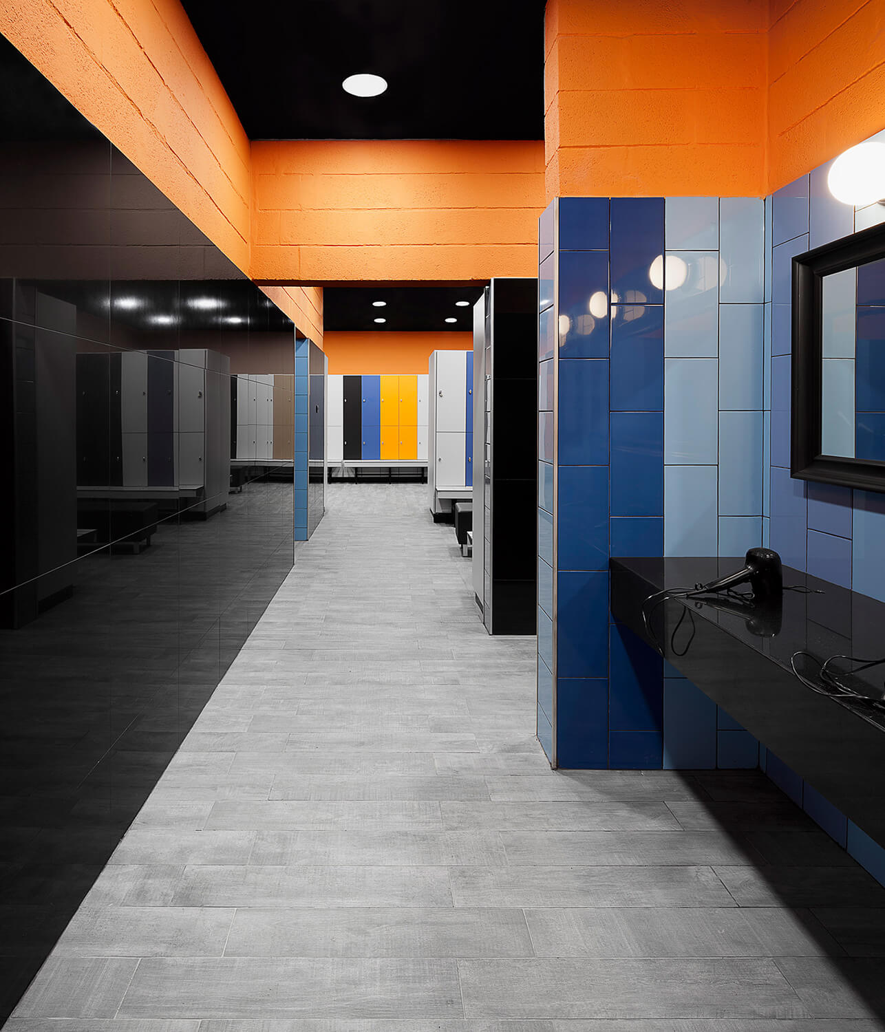
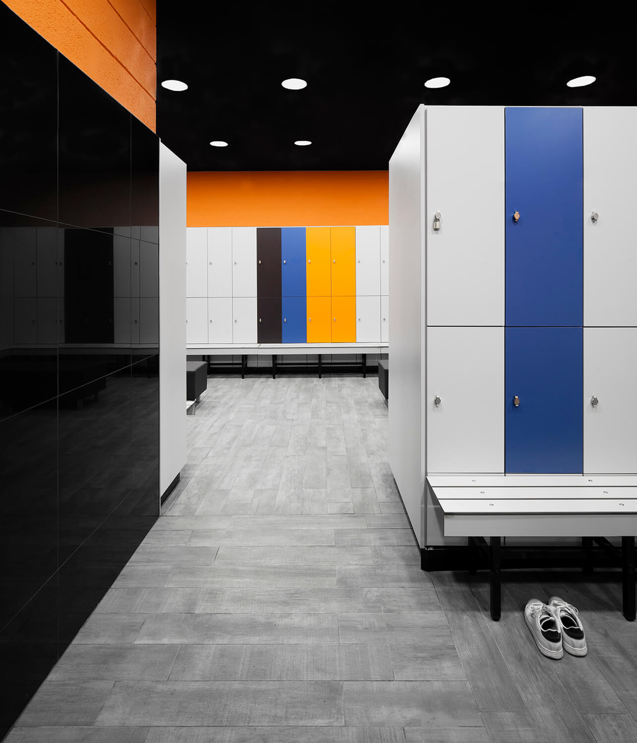
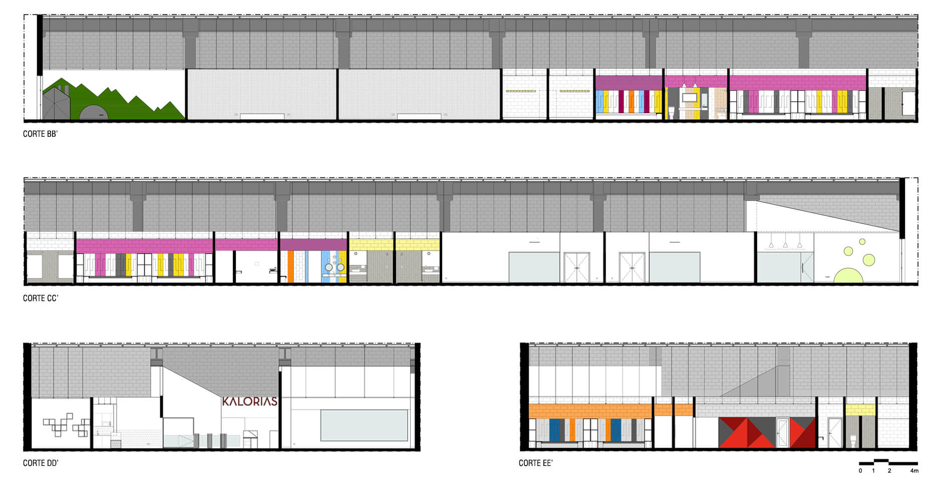
In terms of program our approach was defined by the strategic placement of closed volumes with low dimensions inside the open space, connected by huge voids in-between. We aimed to emphasize the spatial fluidity by painting in black (above 3.5 meters) all structural elements in order to dissimulate their physical limits, thus creating the illusion of a wider area. On the other hand, in the new raised volumes was decided to paint them in white achieving a more efficient diffusion of the natural light, which penetrates the existing glazing into the gym interior. In those volumes, the three Studios and the Kids Area were installed. The dressing rooms and technical areas were positioned at the opposite end of the store front, creating a clear distinction between the activity gym space and the private use areas, enhanced by the clear marking of the physical boundaries that define them. The aesthetics and the materiality of the gym should reflect concepts such as urbanity, energy and diversity – simple but unique. We sought to translate these concepts not only through the space shape, but also through the materials, its colors and textures. Also, as well as responding to the creation of this identity, we always had in mind vectors of more technical nature that guided our choices, related to the specific uses of the different spaces. Since this is a facility for the practice of physical and sporting activities there was a careful choice for durable and impact resistant materials. This results in the application of OSB and Valchromat coverings in the walls more likely to the impact. Always as possible were used concrete blocks, not only to speed up the construction timeline (one of the project constraints), but also due to the rough and rugged appearance that transpires. In the pavement the adopted solution was the application of recycled crumb rubber, whose impact and shock absorption resistance properties are suitable for this type of installation. In the prime areas, specifically near the Gym entrance, smooth plaster covering convey a simplicity and elegance that contrasts with the occasional use – but carefully chosen – of color and textures in the different surfaces of walls and floors. The Reception Counter, designed specifically for this gym, follows the spirit of Kalorias brand, and the movable furniture was chosen to be a highlight inside the space, which design embodies the identity of the gym atmosphere. In the dressing room there was a more daring and experimental attitude, concerning the creation of different environments for distinct genders and users. A specific color study was developed associating distinctive colors for each dressing room, as well as specific ceramics and lockers front panels, with different patterns and metrics. As so, emerges from the combining elements rhythms and contrasts that symbolize the three guiding pillars of the initial concept: urbanity, energy and diversity.

What we did:

  • Architecture, Interior Design, Graphic Design, Furniture design, Identity

Location:

  • Nova Arcada Shopping, Braga, Portugal

Start / Conclusion:

  • 2015 October / 2016 April

Project area:

  • 930 m²

Client:

  • Seasonreturn, S.A.

Cooperating teams:

  • Graphic Design: Deadinbeirute
  • Electrical networks: MELO RODRIGUES
  • Mechanical systems: SPM Engenharia
  • Water and drainage networks: DSE
  • Fire safety systems: DSE

Contractor:

  • Anteros

Photography:

  • Invisiblegentleman

Featured in:

  • Archdaily
  • Archilovers
  • Architizer
  • Retail Design Blog
  • Archello

Share

FacebookPinterestTwitterEmail
On the transition zone between the foyer and the cafeteria one can see a slight difference of its materiality. The bright colors give us an open-space feeling.
Frontal view to the forniture of the foyer. On the background one can see the inside of the cafeteria such as the balcony, chairs and tables or the luminaires.
The interiors of the cafeteria displays a minimilist look. The variation of colors is simple, sanding out only the white, the black and red the colors.
The transition to the inside of the gym is accomplished by crossing the tourniquets area that lead us directly to the entrance hall and the children area.
Frontal view to the entrance of studio A. One can see the yellow graphic design of studio A and the red graphic design that indicates others spaces of the gym.
View to the inside of studio A with a visual relation to its exterior. Graphic elements in arrow shape indicates the orientation of the bicycling exercises.
Designed to atract the cycling feeling, the studio A displays several scenic elements. A road scenery is centered on a wall of the studio behind the bikes.
The cardio studio is a kind of open room area with a peripherical cinder track. The equipments are placed in the center and the walls are coated in OSB.
The accesses to the studios B and C are made by the cardio studio. While going in the direction of the dressrooms, one can also see the inside of the studios.
The asthetics of studio B is here represented in red color. The ceiling is composed by intersperced diagonal lines giving to this space its own identity.
The studio C is a space identified by a signage of green color. The graphic design of this signage represents itself the image of the gym and its brand.
The interior of studio C is represented by a green color standing out from the ceiling stripes. The mirror is an element that gives expression to this space.
It is possible from the interior of studio C to set a visual relation to the cardio exercises room through it's window. This also happens in reverse.
On this image is possible to visualize the studio A interiors from the cardio studio, taking advantage of the natural light coming from the outside of the gym.
The cardio studio is a wide and open space. Its limits are demarcated by a cinder track on the pavement and by the mirrored walls, also coated in OSB panels.
The cardio equipments are placed on the center of the space. The form of this studio is well-marked by the dark shades of the ceiling and the pavement.
The corridor is a circulation space with access to the dress rooms and other spaces. On the entrance one can see a subtle transition of its materiality.
View to the cardio studio showing the different materialities of this space: OSB panels, concrete blocks painted in white and recycled rubber of the pavement.
" As in other spaces, the dryer zone is a space of colored elements. Such elements are for example the mirrors, the ceramic tiles and the silestone counter."
" Inside the kids dressing rooms we immediately witness the colorful tones of blue, yellow, pink and purple, rejoicing for joy, energy and good disposition."
The kids changing rooms are covered in ceramics of various colors, blue, yellow, pink and purple. The lockers in melamine accompany these same colours.
" In the professional's dressing rooms, a simple materiality was applied. It was only used ceramic concrete grey blocks, ceramic tiles and yellow paint."
" The interior of the main hall of the gymnasium is clad to valchromat panels. The geometry and black and red tones were inspired by the brand logotype."
" The women's dressing room washbasin area features light and soft tones. The mirrors are framed in white, the washbasins and the counter are white as well."
" The women's dressing room presents a composition of light tones that fit within a more feminine identity comparing to other areas of this fitness gym."
" The dressing area is composed by colourful lockers that fit the remaining shades of space. The ceiling and floors are the clearest elements of this area."
" These sections represent a coherence of the hights of the different spaces of the gymnasium, and several compositions of colors referring to each function."
The male dressing room is identified by dark and bright tones. From the lockers room, one can see the main colors of this area: black, blue and orange.
The following image shows a general view of some of the elements of the lavatories area. The composition of mirrors alludes to antique painting frames.
" The men's dressing room presents a composition of dark tones that fit within a more masculine identity comparing to other areas of this fitness gym."
" The nutrition office is a simple space. The concrete blocks painted in white colour and the net mounted on the ceiling confere it a minimalist environment."
The plan represents the morphology and distribution of the different spaces of the gymnasium. The access to the different spaces is fluid and continuous.
" These sections represent a coherence of the hights of the different spaces of the gymnasium, and several compositions of colors referring to each function."

TALK TO US ABOUT YOUR NEXT PROJECT


  • Instagram
  • Facebook
  • Pinterest
  • Twitter
  • Email

Estúdio AMATAM © Copyright 2017. All Rights Reserved.