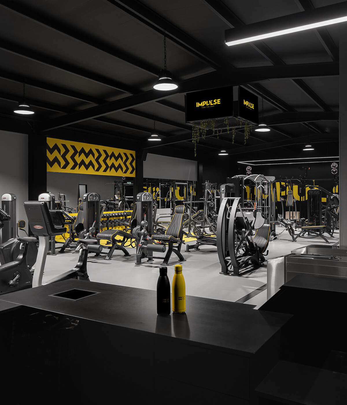
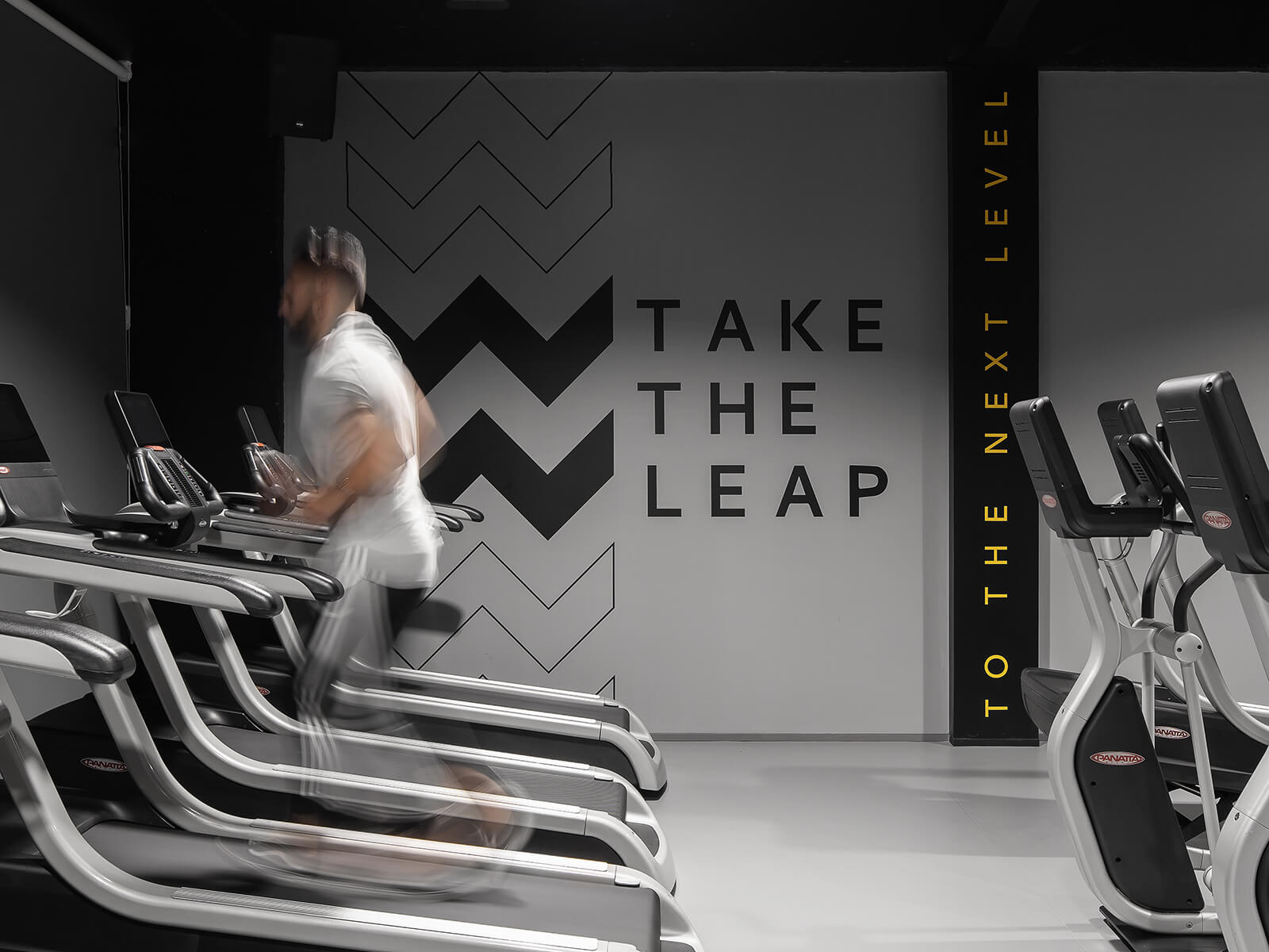
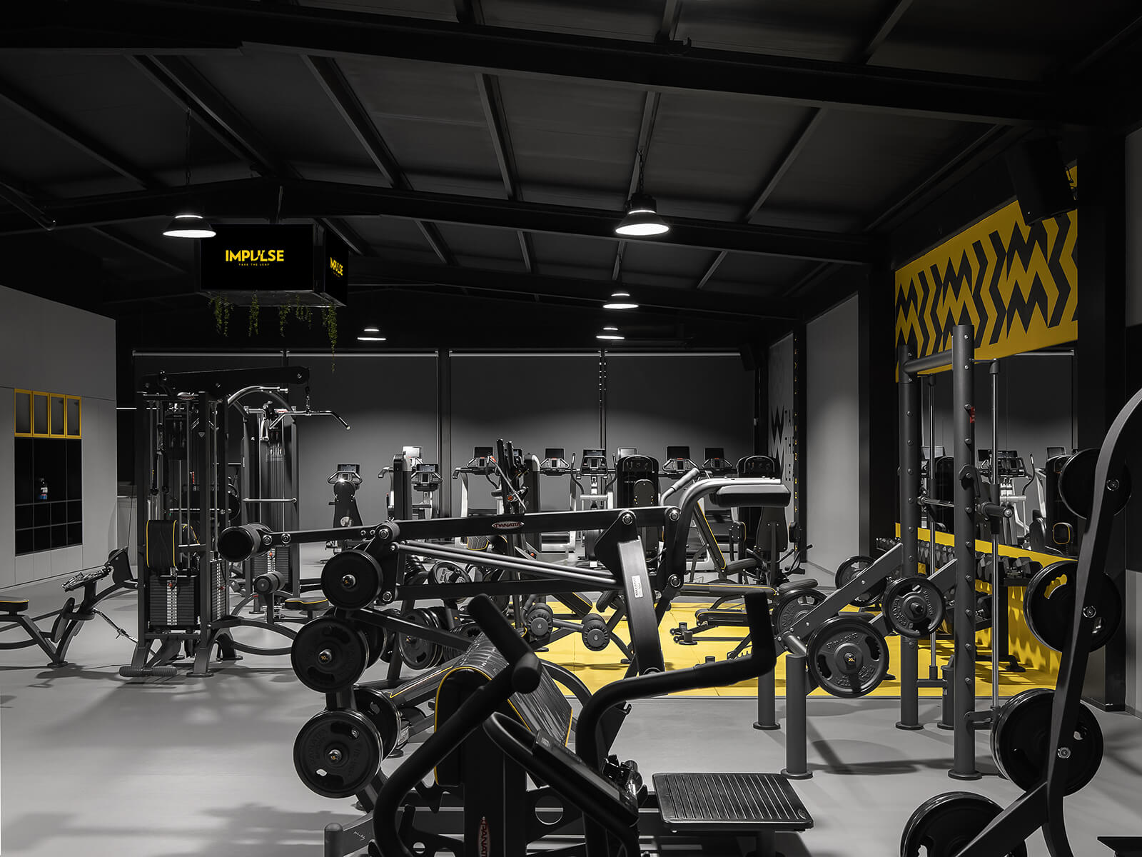
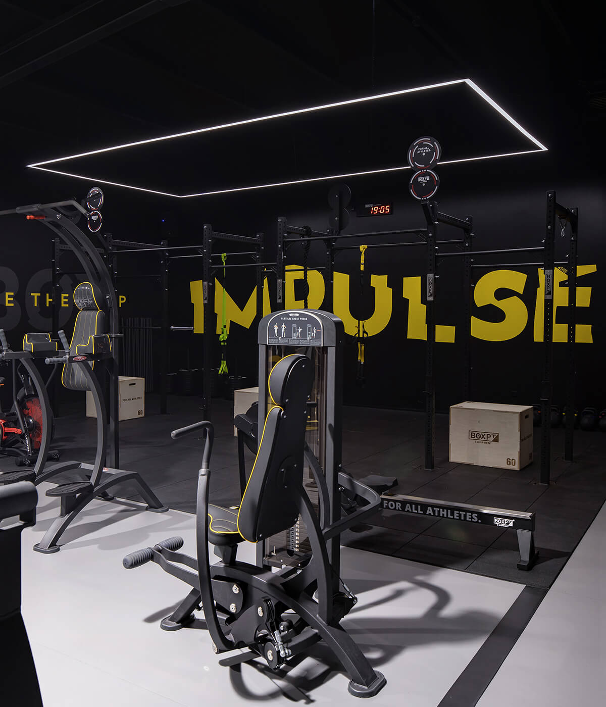
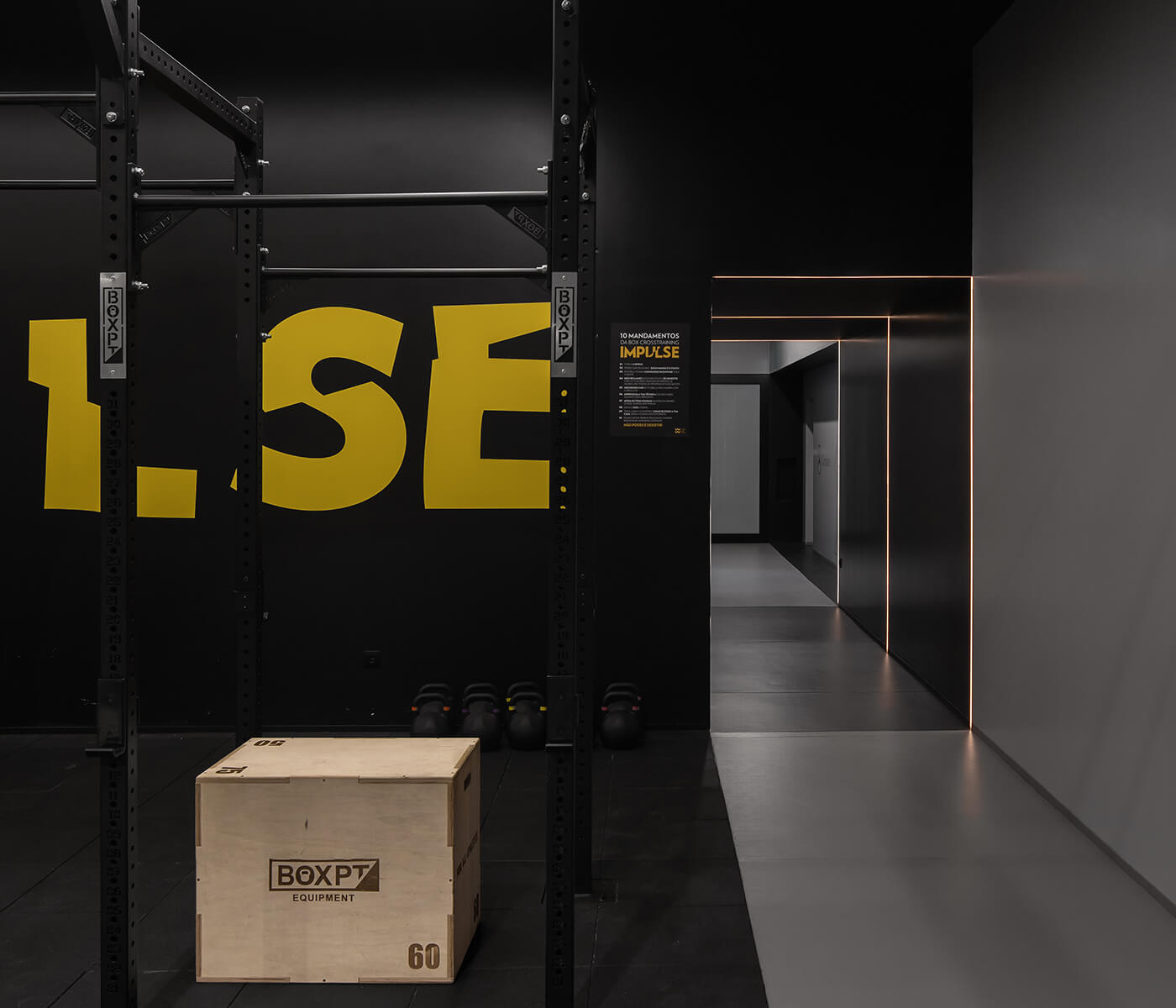
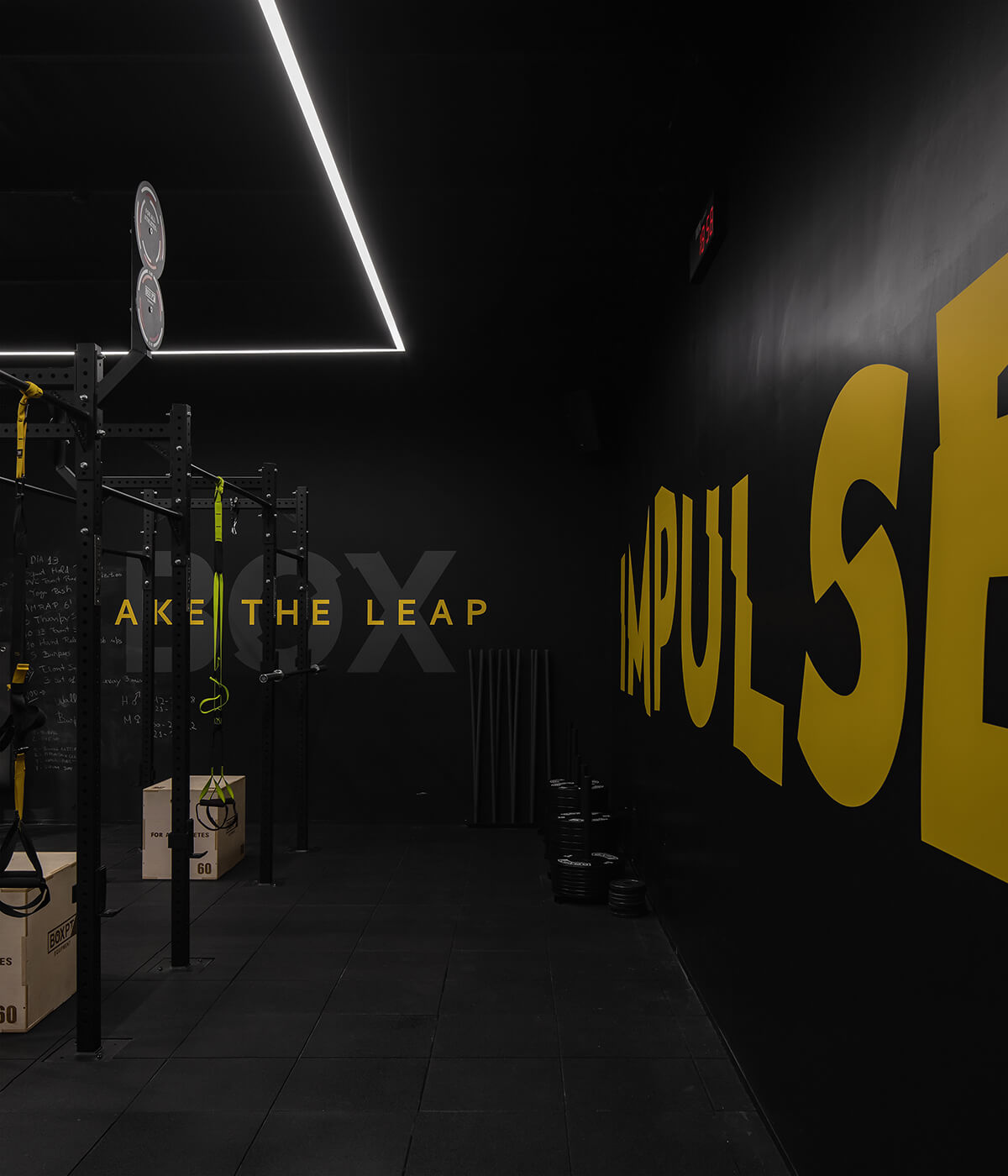
The Impulse clubs have made a conscious decision to incorporate the concept of “monochrome” into their visual style, which has resulted in a unique and distinctive identity for the brand. Rather than relying on bright and intense colours, the clubs have opted for varying shades of black and grey. This decision has allowed them to create a sense of balance and consistency across their spaces, which is both aesthetically pleasing and functional.
The design process involved a transition from 3D to flat views and experimentation with different colours and materials. This approach was taken to create a lively and balanced atmosphere that would enhance the scale and dimension of the exercise room.
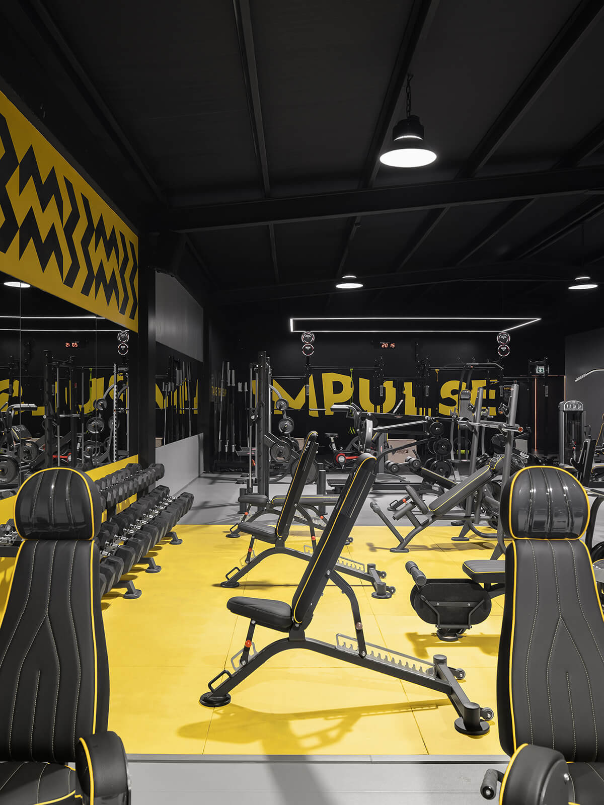
The layout of the club was designed to maximize the available space, with the compact entryway contrasting with the spaciousness of the central area. To achieve this effect, the roof structure of the industrial building was kept visible, taking advantage of the ceiling height and creating a sense of neutrality with the predominance of grey. The use of vibrant yellow punctuates the space, demarcating the free weights zone and providing a striking contrast to the muted colour palette.
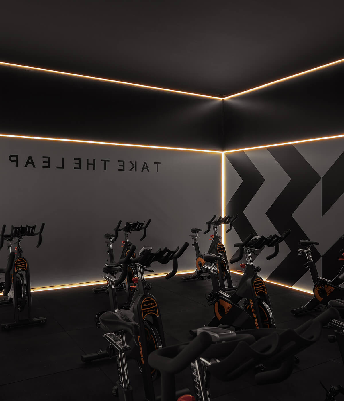
Each studio in the club has its own language and identity, with Studio 1 being a black space dedicated solely to cycling classes. Its geometry is demarcated by a continuous line of light that illuminates the graphics on the vertical walls, creating a stunning visual effect. The full-length wall mirror next to the stage reflects this game of light and shapes, creating an optical illusion that distorts the perception of the size of the room.
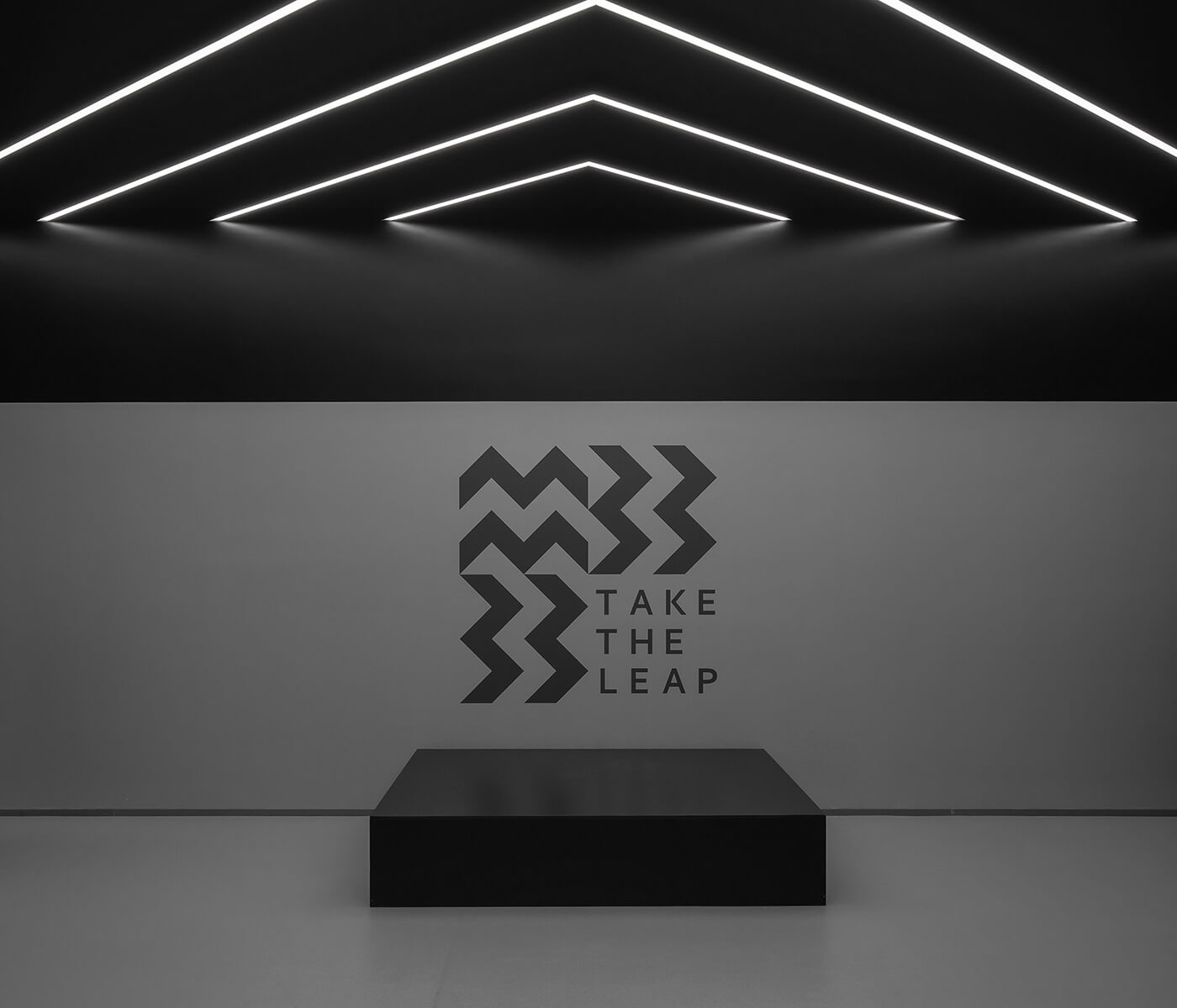
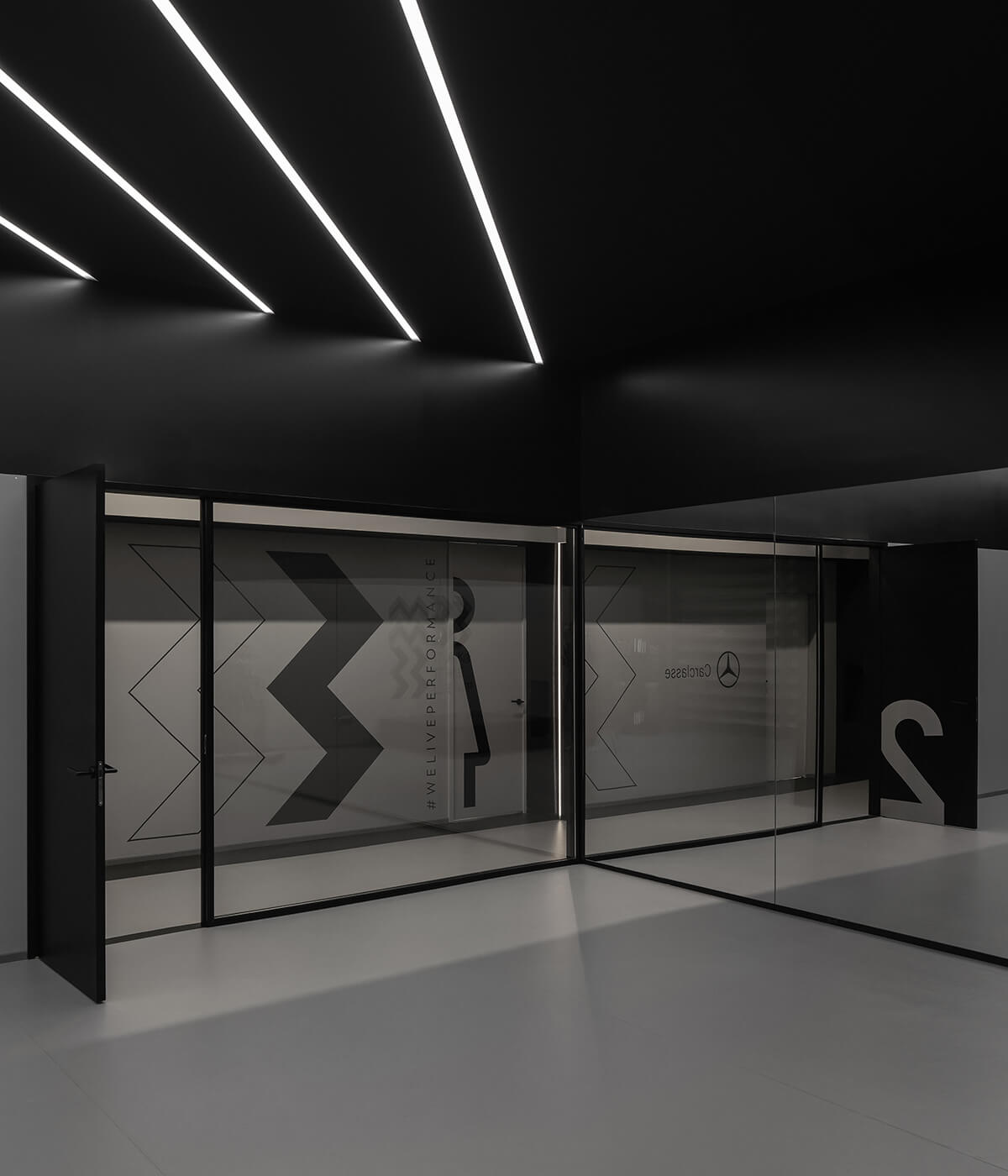
Studio 2, on the other hand, is designed to be subtle and neutral. It challenges the orthogonality of the space with the tension created by the ceiling lines of light.
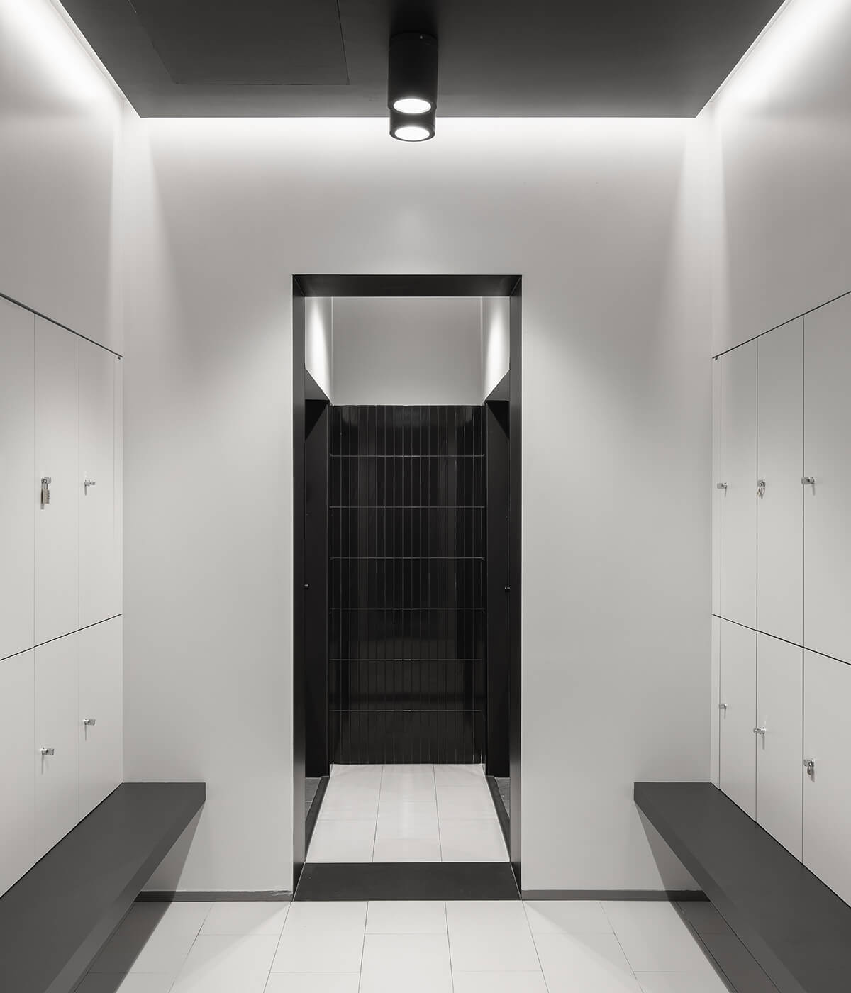
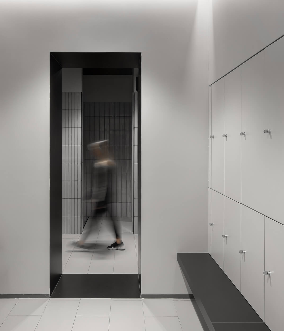
The dressing rooms are optimized and organized along an axis to make the most of the available area. The space maintains the same design strategy and concept adopted in the other spaces of the club but explores different materials, such as recycled marble and satin-finish ceramics. Symmetry, perpendicularity, and rigidity contrast with the bold use of materials and patterns. The colour yellow appears as an element of surprise throughout the club, present inside the lockers and revealed to those who open them. Even the simpler spaces in the club, such as the dressing rooms, have their own story to tell, with their design telling a story of symmetry, perpendicularity, and rigidity, contrasted by the daring use of materials and patterns. The result is a cohesive and striking visual style that is both functional and aesthetically pleasing.


